Bootstrap 5 tutorial - Learn how to get started without jQuery
About one month ago we found out that the first version of Bootstrap 5 alpha has been officially released with some of the most important changes being removing jQuery as a dependency, dropping support for IE 10 and 11 and generally improving the markup and stylesheets for the most popular CSS framework in the world.

Although it’s still just an alpha version and using Bootstrap 5 in production may be risky due to unforeseen bugs it might be a good idea to start working around with the new version of the framework and more importantly if you’ve been accustomed to using jQuery this change may make you consider using Vanilla JS by default.
In this Bootstrap 5 tutorial we will show you how to set up a working environment with Sass and Gulp, create a simple blog page and see how to use the framework using Vanilla JS. Here’s the table of contents:
- Building tools: set up Bootstrap 5 with Sass, Gulp 4 and BrowserSync
- Creating a simple blog page with the new markup
- Changing some colors, sizings and fonts in the new Sass variables file
- Working with Vanilla JS instead of jQuery
- Exploring the new Utility API
Bootstrap 5 with Sass, Gulp 4 and BrowserSync
Although you can quickly get started using Bootstrap 5 by including the stylesheet and scripts via CDN, we recommend using Sass to make use of all of the features of the new version of the CSS framework.
About a month ago we wrote a tutorial on how you can set up Bootstrap, Sass, Gulp and BrowerSync, so if you want a more detailed walkthrough of process you can read that guide.
Prerequisites:
- Node - make sure you have Node.js installed and that it is accessible via the terminal
- Gulp - after you have Node successfully installed, make sure you also install Gulp’s CLI.
After you have installed Node on your machine, run the following command in your terminal to globally install the Gulp CLI:
npm install --global gulp-cli
This is how the folder structure will look at the end of this tutorial:
.
├── app
│   ├── css
│   │   └── themesberg.css
│   ├── index.html
│   ├── js
│   │   └── themesberg.js
│   └── scss
│       ├── _utilities.scss
│       ├── _variables.scss
│       └── themesberg.scss
├── gulpfile.js
├── package-lock.json
└── package.json
Note: get the files from the public Github repository.
Installing NPM dependencies
We’re going to need to pull in Gulp, BrowserSync, Gulp Sass and Bootstrap 5 Alpha as a dependency through NPM. But first, we need to create a local package.json file by running the following command:
npm init
You will be asked to give the project a name, description and so on. Most of the details are optional and you can just “enter your way through”. After you have finished the process a new package.json file will be created.
Afterwards you will need to run the following command to actually install the dev dependencies:
npm install browser-sync gulp gulp-sass --save-dev
Make sure to also run the following command to install the latest version of Bootstrap 5:
npm install bootstrap@next --save
Note: if the above command does not install Bootstrap 5 anymore (this will happen if it becomes the stable default version) make sure to visit the official NPM versioning page to see how to include it via the package manager system.
Create a gulpfile to compile Sass files and create a local server via BrowserSync
First of all you will need to create a local “gulpfile.js” at the root folder of your project where package.json is also located. Then add the following code into the file:
var gulp        = require('gulp');
var browserSync = require('browser-sync').create();
var sass        = require('gulp-sass');

// Compile sass into CSS & auto-inject into browsers
gulp.task('sass', function() {
    return gulp.src("app/scss/*.scss")
        .pipe(sass())
        .pipe(gulp.dest("app/css"))
        .pipe(browserSync.stream());
});

// Static Server + watching scss/html files
gulp.task('serve', gulp.series('sass', function() {

    browserSync.init({
        server: "./app/"
    });

    gulp.watch("app/scss/*.scss", gulp.series('sass'));
    gulp.watch("app/*.html").on('change', browserSync.reload);
}));

gulp.task('default', gulp.series('serve'));
The first part of the file is about including the dependencies that you have installed via NPM in the previous step. Next is our first Gulp command called serve which essentially starts a new local server based on the files within the app/ folder and watches for any changes (ie. file saves that you make when writing code) inside the app folder for *.scss and *.html files.
The second command is called sass which takes all *.scss files (Sass files) inside the app/scss/ folder and compiles them into a singe CSS file called themesberg.css. You will include this in your HTML templates.
Finally, the last line gulp.task('default', ['serve']); enables you to start the local server and watch for SASS file changes and compile them by only writing gulp in the command line. That’s what “default” refers to.
Include the Bootstrap Sass files into your workflow
Next you need to create a scss/ folder inside the main app/ folder and create a new file called themesberg.scss. After that you need to add the following line inside it:
@import '../../node_modules/bootstrap/scss/bootstrap.scss';
What this does is that it includes the Bootstrap Sass files from the node_modules/ folder. This will help you be able to overwrite the default variable values of the colors, sizes, spacings and so on.
Create a new index.html file inside the app/ folder and add the following markup and buttons inside:
<!DOCTYPE html>
<html lang="en">
    <head>
        <meta charset="UTF-8">
        <meta name="viewport" content="width=device-width, initial-scale=1.0">
        <title>Bootstrap 5 tutorial by Themesberg</title>
        <link rel="stylesheet" href="css/themesberg.css">
    </head>
    <body>
        <button class="btn btn-primary">Primary</button>
        <button class="btn btn-secondary">Secondary</button>
        <script src="https://cdn.jsdelivr.net/npm/[email protected]/dist/umd/popper.min.js" integrity="sha384-Q6E9RHvbIyZFJoft+2mJbHaEWldlvI9IOYy5n3zV9zzTtmI3UksdQRVvoxMfooAo" crossorigin="anonymous"></script>
    <script src="https://stackpath.bootstrapcdn.com/bootstrap/5.0.0-alpha1/js/bootstrap.min.js" integrity="sha384-oesi62hOLfzrys4LxRF63OJCXdXDipiYWBnvTl9Y9/TRlw5xlKIEHpNyvvDShgf/" crossorigin="anonymous"></script>
    </body>
</html>
To test the whole thing out, just run gulp in your terminal in the folder where gulpfile.js is located (ie. the root folder). Shortly after, a new tab should pop up in your browser with the url http://localhost:3000/ showing you two nicely styled Bootstrap buttons.
If this didn’t happen, make sure you have downloaded all of the dependencies via NPM and that the structure of the folders and files is the same as in the article.
Now try changing the text of one of the buttons to Themesberg. If you save the file and go back to your browser you will see that the change has been made without needing to refresh the browser. Awesome! This will save you a lot of time and manual refreshing from now on ?
Creating a simple blog page with the new markup
Great job so far! You have successfully set up a pretty cool working environment to compile the Sass files from Bootstrap 5 and also create a local server that takes your changes immediately as you write code.
That’s a lot of work for just a page showing two buttons though, isn’t it? Don’t worry, in this section we will create a page with a navigation bar, a list of blog cards, pagination and a footer with the newest Bootstrap 5 components!
Adding the navigation bar
Because Bootstrap 5 has such a great documentation with all of the components, we will simply take the markup for a navigation bar from the official navbar component page. After removing some of the element, add the following code right after the opening of the body tag:
<nav class="navbar navbar-expand-lg navbar-light bg-light">
    <div class="container-fluid">
        <a class="navbar-brand" href="#">Bootstrap 5 tutorial</a>
        <button class="navbar-toggler" type="button" data-toggle="collapse" data-target="#navbarSupportedContent" aria-controls="navbarSupportedContent" aria-expanded="false" aria-label="Toggle navigation">
        <span class="navbar-toggler-icon"></span>
        </button>
        <div class="collapse navbar-collapse" id="navbarSupportedContent">
        <ul class="navbar-nav mr-auto mb-2 mb-lg-0">
            <li class="nav-item">
            <a class="nav-link active" aria-current="page" href="#">Home</a>
            </li>
            <li class="nav-item">
            <a class="nav-link" href="#">Blog</a>
            </li>
        </ul>
        <form class="d-flex">
            <input class="form-control mr-2" type="search" placeholder="Search" aria-label="Search">
            <button class="btn btn-outline-success" type="submit">Search</button>
        </form>
        </div>
    </div>
</nav>
Main content, blog card and sidebar
Now that we have the navigation bar in order we should start building the main content part of the page. The first element will be a container and inside we will create two main rows: the blog cards section and the sidebar. Here’s the markup that we used right after the <nav> element:
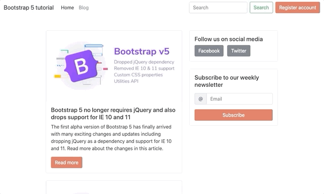
<div class="container my-5">
    <div class="row d-flex justify-content-center">
        <!-- Main row for blog posts -->
        <div class="col-12 col-lg-6">
        <div class="card">
            <img src="https://themesberg.s3.us-east-2.amazonaws.com/public/posts/bootstrap-version-5-alpha-launched.jpg" class="card-img-top" alt="...">
            <div class="card-body">
                <h5 class="card-title">Bootstrap 5 no longer requires jQuery and also drops support for IE 10 and 11</h5>
                <p class="card-text">The first alpha version of Bootstrap 5 has finally arrived with many exciting changes and updates including dropping jQuery as a dependency and support for IE 10 and 11. Read more about the changes in this article.</p>
                <a href="#" class="btn btn-primary">Read more</a>
            </div>
            </div>
        </div>
        <!-- Sidebar (related articles, newsletter signup etc) -->
        <div class="col-12 col-lg-4">
	  <!-- Sidebar content goes here -->
        </div>
    </div>
</div>
Pretty cool, right? But that blog card seems quite lonely there, so let’s add a few more. Don’t forget to add the mb-4 utility class to the first blog card though to create good spacing between the cards.
But what happens when you will have more than 10 blog entries on the page? You can’t show too many items since the loading time for the page will increase too much. That’s why we will need a pagination section right at the bottom of the last blog card. Add the following code:
<nav aria-label="Page navigation example">
  <ul class="pagination">
    <li class="page-item"><a class="page-link" href="#">Previous</a></li>
    <li class="page-item"><a class="page-link" href="#">1</a></li>
    <li class="page-item"><a class="page-link" href="#">2</a></li>
    <li class="page-item"><a class="page-link" href="#">3</a></li>
    <li class="page-item"><a class="page-link" href="#">Next</a></li>
  </ul>
</nav>
Now that we have taken care of the left side of the page, the sidebar looks quite empty. Let’s add a section to sign up for a newsletter as it is very common nowadays to have a newsletter coupled with a blog. Add the following code inside the sidebar:
<div class="card" >
    <div class="card-body">
        <h5>Subscribe to our weekly newsletter</h5>
        <form action="#">
            <div class="input-group my-3">
                <span class="input-group-text" id="email-at">@</span>
                <input type="email" class="form-control" placeholder="Email" aria-label="Email" aria-describedby="email-at" required>
            </div>
            <button type="submit" class="btn btn-block btn-primary">Subscribe</button>
        </form>
    </div>
</div>
Of course that’s just one item for the sidebar, but you can also add related articles, social media or other featured posts sections as well.
Customize the project via the Bootstrap 5 Sass variables
Looks pretty good, but it’s just the default Bootstrap styles and colors. Let’s make it a bit more unique! This is where Sass shows its true powers by making customization so much easier via the Bootstrap 5 variables. Let’s change the primary color to our favourite one from Themesberg.
First of all you need to create a new _variables.scss file inside the scss/ folder and import this file in the themesberg.scss file like this:
@import 'variables';

@import '../../node_modules/bootstrap/scss/bootstrap.scss';
Inside the variables.scss file just add the following variable which will override the default $primary variable color which is blue by default:
$primary: #e06b54;
That’s just one variable! But how do you find out about the other variable names which change the font family, sizing, spacings and so on? It’s simple! Just search for the _variables.scss file inside the Bootstrap folder from the node_modules/ folder.
Here’s the full path: node_modules/bootstrap/scss/_variables.scss. Essentially you can take any variable from there and override it in your local _variables.scss file and it will change the styles for your project. Awesome, right?
Working with Vanilla JS instead of jQuery
Although you will still be able to use jQuery with Bootstrap 5 according to the official documentation we actually recommend using Vanilla JS because you will be saving some loading time by not including another dependency and making your project faster and leaner. The document.querySelector will do just fine instead of the popular $ selector.
We’ll go through some of the Vanilla JS Bootstrap 5 use cases for elements such as tooltips and modals.
Bootstrap 5 tooltips via Vanilla JS
Let’s add another card to the sidebar with some social media links for those who want to join the community after reading a blog post. We used the following markup and also added tooltips when hovering over the buttons:
<div class="card mb-4">
    <div class="card-body">
        <h5>Follow us on social media</h5>
        <a href="https://www.facebook.com/themesberg/" class="btn btn-secondary mr-2" data-toggle="tooltip" data-placement="top" title="Like us on Facebook">
            Facebook
        </a>
        <a href="https://twitter.com/themesberg" class="btn btn-secondary" data-toggle="tooltip" data-placement="top" title="Follow us on Twitter">
            Twitter
        </a>
    </div>
</div>
But the tooltips aren’t working! Why? Because they are opt-in and the need to be initialized via Javascript. Here’s how you can do that for every tooltip on the page via Vanilla JS:
var tooltipTriggerList = [].slice.call(document.querySelectorAll('[data-toggle="tooltip"]'))
var tooltipList = tooltipTriggerList.map(function (tooltipTriggerEl) {
  return new bootstrap.Tooltip(tooltipTriggerEl)
})
We created a themesberg.js file within the js folder and added the code there. Make sure to include this file in your index.html as well. The code above takes all of the elements on the page that have the attribute data-toggle=”tooltip” and then initializes each and every one of them. You’ll also have the full list of elements available in the tooltipList variable.
Bootstrap 5 modals via Vanilla JS
In order to showcase the usage of modal with Bootstrap 5 we will create a register account feature via modal toggling. The first would be to add a button after the search element in the navigation bar:
<button class="btn btn-primary" id="registerAccountButton">Register account</button>
Then add the following modal before the script tags start at the end of the body tag:
<div class="modal" tabindex="-1" id="registerAccountModal">
<div class="modal-dialog">
<form action="#" class="modal-content">
<div class="modal-header">
<h5 class="modal-title">Register account</h5>
<button type="button" class="close" data-dismiss="modal" aria-label="Close">
<span aria-hidden="true">×</span>
</button>
</div>
<div class="modal-body">
<div class="mb-3">
<label for="email" class="form-label">Email address</label>
<input type="email" class="form-control" id="email" placeholder="[email protected]" required>
</div>
<div class="mb-3">
<label for="password" class="form-label">Password</label>
<input type="password" class="form-control" id="password" required>
</div>
<div class="mb-3">
<label for="confirmPassword" class="form-label">Confirm password</label>
<input type="password" class="form-control" id="confirmPassword" required>
</div>
</div>
<div class="modal-footer">
<button type="button" class="btn btn-secondary" data-dismiss="modal">Close</button>
<button type="submit" class="btn btn-primary">Save changes</button>
</div>
</form>
</div>
</div>
After that markup has been added you will need to toggle the modal when the register button has been pressed. Add the following code to the themesberg.js file:
var registerAccountButton = document.getElementById('registerAccountButton');
var registerAccountModal = new bootstrap.Modal(document.getElementById('registerAccountModal'), {
    keyboard: false
})
registerAccountButton.addEventListener('click', function () {
    registerAccountModal.toggle();
})
The code above selects the button and the modal, creates a Bootstrap 5 modal object and then when the button is pressed the modal will be toggled.
Of course you can do all of this via the data attributes method, however this way you will have the modal as an object in your Javascript code and manipulating it programmatically will be much easier.
Exploring the new Utility API
The new Utility API comes as a response to the growing adoption of utility first front-end development, specifically Tailwind CSS. We wrote an article a few months ago comparing Tailwind CSS with Bootstrap 4 if you’d like to learn more about the differences.
The new Utility API is basically a way to easily create new custom utility classes to change properties such as opacity, width, colors, sizing, spacing… anything really. What is really cool is that it takes some parameters and it will automatically generate the CSS classes for you. Just create a file called _utilities.scss inside the scss folder, import it in the themesberg.scss file and add the following code:
$utilities: (
  "opacity": (
    property: opacity,
    values: (
      0: 0,
      25: .25,
      50: .5,
      100: 1,
    )
  )
 );
This will generate the following output:
.opacity-0 {
    opacity: 0;
}
.opacity-25 {
    opacity: .25;
}
.opacity-75 {
    opacity: .75;
}
.opacity-100 {
    opacity: 1;
}
So let’s take a step back and see what happened. First of all, the “opacity” part of the code will set the name the first part of the class will have (ie. “.name-value”). Then you need to set the actual property for the class (in this case it’s opacity, but it could be box-shadow, width, height etc) and then the actual values.
In this case we added four values ranging from 0 to 100 for the opacity. Note that the first part (ie. the key) is what will be used in the class name and the value will be the actual value used for the opacity.
Here’s another cool thing that you can do. Add the responsive: true flag and it will generate responsive class (sm, md, lg) for all of the utility classes:
$utilities: (
  "opacity": (
    property: opacity,
    responsive: true,
    values: (
      0: 0,
      25: .25,
      50: .5,
      100: 1,
    )
  )
 );
This will generate the following output:
.opacity-0 {
    opacity: 0;
}
.opacity-25 {
    opacity: .25;
}
.opacity-75 {
    opacity: .75;
}
.opacity-100 {
    opacity: 1;
}
@media (min-width: 576px) {
    .opacity-sm-0 {
        opacity: 0;
    }
    .opacity-sm-25 {
        opacity: .25;
    }
    .opacity-sm-75 {
        opacity: .75;
    }
    .opacity-sm-100 {
        opacity: 1;
    }
}
@media (min-width: 768px) {
    .opacity-md-0 {
        opacity: 0;
    }
    .opacity-md-25 {
        opacity: .25;
    }
    .opacity-md-75 {
        opacity: .75;
    }
    .opacity-md-100 {
        opacity: 1;
    }
}
@media (min-width: 992px) {
    .opacity-lg-0 {
        opacity: 0;
    }
    .opacity-lg-25 {
        opacity: .25;
    }
    .opacity-lg-75 {
        opacity: .75;
    }
    .opacity-lg-100 {
        opacity: 1;
    }
}
@media (min-width: 1200px) {
    .opacity-xl-0 {
        opacity: 0;
    }
    .opacity-xl-25 {
        opacity: .25;
    }
    .opacity-xl-75 {
        opacity: .75;
    }
    .opacity-xl-100 {
        opacity: 1;
    }
}
Quite amazing, right? These are just a few examples of the Utility API that you can use to make your job easier when coding user interfaces. Check out the whole official Utility API documentation for this section.
Alright, that’s about it for this tutorial! You learned how to set up a working dev environment using Gulp 4, Sass and BrowserSync, created a blog page, learned some use cases of vanilla JS with Bootstrap 5 and explored the new Utility API. We created a public repository on Github with the project files here. Give it a lucky star if you appreciate this tutorial ⭐️
Before you go, allow me to present you a UI kit that we’ve been working for more than a year here at Themesberg. It’s called Pixel Pro and it is a Bootstrap 5 UI kit featuring over 1000 components, 50+ sections, 35 example pages and even a user dashboard.
Pixel Pro Bootstrap 5 UI Kit
It’s available in both the latest stable version of Bootstrap 4.5 and 5 alpha and it can help you save time, energy and money when building awesome user interfaces and websites. It is created using state of the art design principles, accessibility and code quality.
Another project that we've been working on is called Volt and it is a free and open-source Bootstrap 5 Admin Dashboard that has been styled by professional designers and has quite a few more features that the dashboard that we have built for this tutorial.
Volt - Free Bootstrap 5 Admin Dashboard
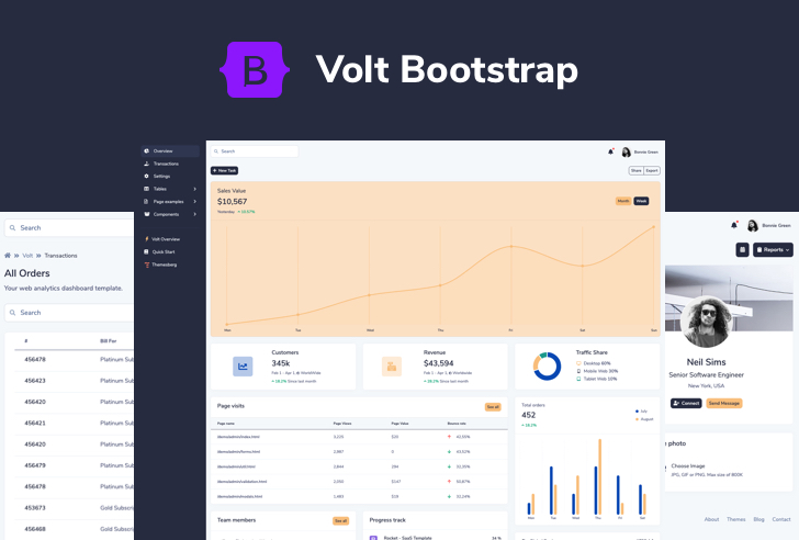
It features over 100 Bootstrap 5 components, 11 example pages, and 3 plugins. We also included Sass files and an advanced Gulp command system which lets you create a local server using BrowserSync and watch for file changes as you develop.
Last week it became trending on GitHub, HackerNews, and Product Hunt and the best news is that it is completely free to use.
Alternatively, you can also opt-in for a more professional version of Volt which has 20 example pages, over 800 components, and 10 plugins that can bring your dashboard interface to the next level.
Volt - Premium Bootstrap 5 Dashboard

You can consider Volt Pro to be a pro extension of the free version having 3x more components, pages, and plugins that you can work with. By purchasing it for only $59 you will get at least 6 months of premium support and free updates.
You can check out all our Free and Premium Bootstrap 5 Themes, Templates and UI Kits on our dedicated page.