Introducing FlowBite: a figma design kit built for integration with Tailwind CSS
It’s been a while since I last posted on the blog, but today I want to talk a bit about our newest project: FlowBite. Basically, it is a Figma design kit that is built for integration with Tailwind CSS. This means that all of the style properties, such as typography, spacing, shadows, colors are all completely identical to the default utility-classes from Tailwind CSS.
I will tell you some more about the content and features of the Figma kit, but first I want to tell you my experience integrating a design built with this Figma kit using Tailwind CSS. The landing page for FlowBite was designed with this UI kit and also built in Tailwind CSS by me.
I must say that I only had to write a few extra CSS classes, and that would be for the YouTube video. Absolutely mindblowing!
In all my years of experience developing websites, there were always problems when I had to take a new design and code it because I had to recreate a new set of style guidelines using CSS classes, and it was never the same from one project to another. I would be a millionaire if I would get a dollar for every minute spent on writing CSS classes.
Video presentation
I also want to mention that a talented designer and YouTube influencer decided to make a video about FlowBite. I’ll embed the video below so you can take a look.
Allow me to present you some of the features of the Figma design kit.
Integrate with Tailwind CSS
As I have already mentioned previously, the magic of this Figma design kit is that all of the style properties can be coded using the default utility classes from Tailwind CSS. Of course, if you want to change the colors, the typography or anything else you can do it using the Tailwind configuration file.
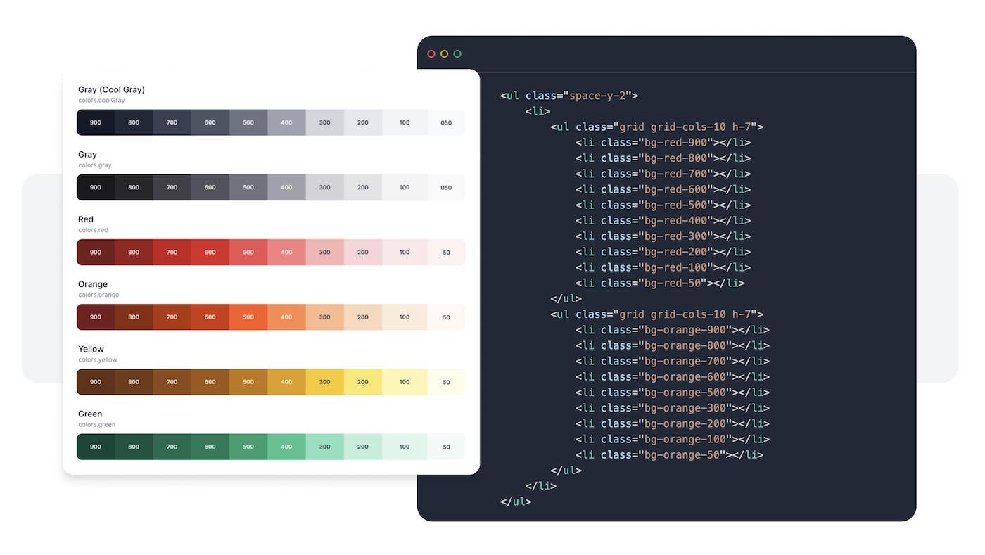
Although FlowBite doesn’t come with the code yet, we are already actively working on it and we are planning to release it on the 10th of August, 2021. Everything that you now see in the Figma file, there will be a fully coded version in Tailwind CSS.
27 application UI pages
Our main focus in terms of pages was an application UI (aka. admin dashboard interface) that can be used for multiple situations: an administrative panel, a dashboard for a logged in user, an email application, and many more.
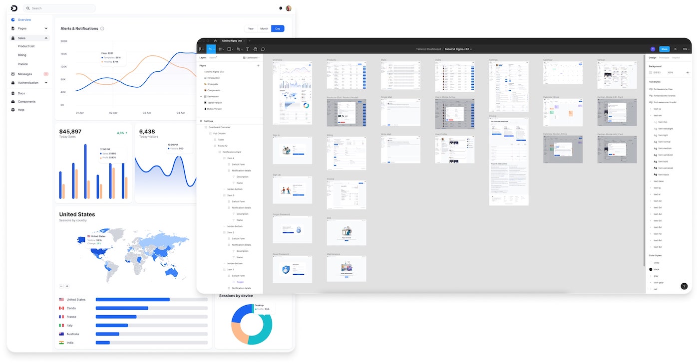
We’ve covered a lot of page examples, such as an overview page with charts, user list, CRUD item list, messaging, invoicing, user authentication pages, error pages, and many more.
Check out this live preview on Figma to view all of the pages.
Responsive pages (mobile & tablet included)
Did you know that internet usage last year was around 54.24% on mobile devices, 2.85% on tablet devices, and only 42.9% on laptop and desktop? Not only that, but experts are expecting even more mobile devices usage in the future.
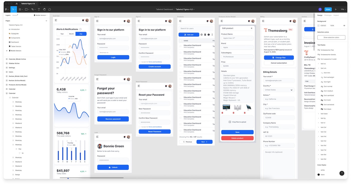
Responsive design for some years now is not really a feature, but more of a requirement. There are many disadvantages for a non-responsive user interface, including a bad experience for the user, SEO penalizations, and many more.
We have designed all of the application UI pages for both mobile, tablet and desktop devices separately. Most Figma kits don’t provide a separate tablet layout, but we wanted to go all the way through with the quality of this product, so we did it.
Style guideline
The backbone of any high-quality design system/UI kit has to be a style guideline of colors, typography, spacing, shadows, and more. FlowBite has been built from the ground up: with the style guideline in the center of it all.
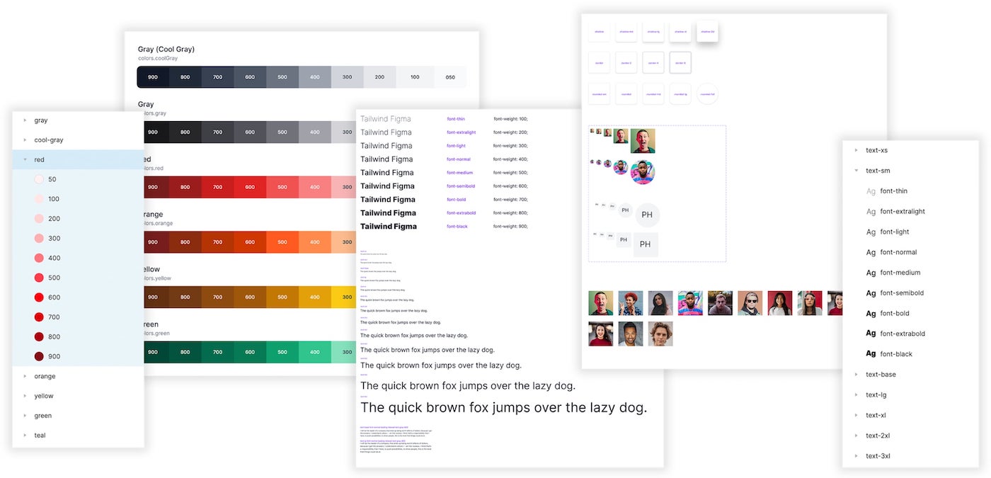
You can preview the style guide in the Figma preview.
Figma variants
This is the most amazing feature of this Figma UI kit, because there are so many of them! If you don’t know, Figma variants are a new feature that enables you to create different styles and variants for components or sections.
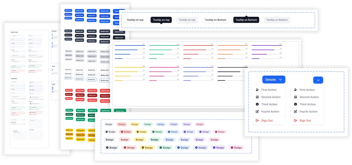
An example would be a button component, where you can create variants for different states, such as hovered state, focused state, or variants for different colors, or variants for outline style or full style.
If you need some clarification, please check out Arnau’s video about FlowBite’s variants and you’ll understand the advantages.
Auto layout
The new auto layout feature from Figma is another powerful addition to the FlowBite Figma kit which enables you to easily change the order and size of spacing and positioning of the elements and sections in your design file.
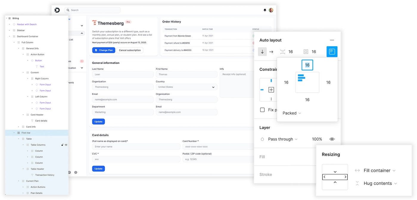
You can check out this feature by viewing Arnau’s presentation of the UI kit.
Roadmap
Another great news for those who decide to purchase this product is that what you see right now is barely 10% of what the UI kit will look like in a year from now. As of now, we have finished about a third of the first phase of the roadmap, which is the Figma base project:
- Style guideline
- Auto layout setup
- UI components and variants
- Application UI pages
- Responsive interface for mobile and tablet devices
As I’m writing this article, we are already working on the next part of the first phase, which is coding the whole Figma kit in Tailwind CSS:
- Tailwind CSS base project
- Setup style guidelines
- Code the UI elements
- Code the Application UI pages
- Responsive interface
- Build documentation
- Test for production mode and browsers
- Optimize speed
If you want to learn more about the roadmap, please check it out on the FlowBite roadmap section.
Pricing plan
We have worked a lot on this project, and we believe that any designer or developer can use this set of products to prototype, design, and integrate user interfaces for websites much faster. We also believe that the design is quite versatile and you can easily use it for multiple projects. This is why we decided that once you purchase a plan, you can use it for unlimited projects.
The pricing plan is pretty straightforward:
- Figma files only: $129 + VAT
- Figma files + Tailwind CSS code pre-order:
$278$189 + VAT (20% off) - Tailwind CSS code pre-order:
$149$119 + VAT (20% off)
If you have any questions you can check out the FAQ section or just contact us.
You can also read more about the licensing terms.
Free community edition
This is Themesberg, so we decided to also create a free and open-source version of the FlowBite kit that you can try out before committing to the full version. You can duplicate it on the Figma community page.
