How to set up Gulp 4, Bootstrap, Sass and BrowserSync for a simple workflow
If you’re rather new to web development you might have heard about Sass and toolkits such as Gulp/Grunt that can improve both your workflow and the modularity of your stylesheets. Sometimes it can be a bit difficult to really understand the whole process.
In this tutorial I would like to explain what each of these tools are and how they can improve your workflow when building awesome websites. Let’s start by describing each one.
Gulp.js
Gulp JS is an open source Javascript toolkit developed by Eric Schoffstall which is being used by millions of developers to use as a streaming build system for front-end web projects. Gulp can be used to automate certain tasks such as compiling Sass into CSS, minify code, optimize images, unit testing and many more.
Bootstrap CSS
Bootstrap is the most popular CSS Framework currently used by at least 7.9 million live websites according to the Bootstrap CDN statistics. It is an open source project originally developed by Mark Otto and Jacob Thornton almost a decade ago. It can be used to save time and effort by using predefined web components such as buttons, cards, navigation bars and powerful utility classes to create responsive layouts.
Sass
Sass is a style sheet language released almost 13 years ago which is sort of an extension for regular CSS capabilities. Using Sass you can make us of variables, mixins (functions) and better organize your style sheets structure overall. It is highly recommended as it will save you a lot of time and effort down the road.
BrowserSync
BrowserSync is a powerful tool that you can use with Gulp or Grunt to improve your development workflow with time-saving synchronised browser testing. Shortly put, you won’t have to refresh the page every time you change something in your code. It will do it for you as soon as you save a file in your project folder.
Now that you have a better understanding of each of these technologies we can start setting them all up so that you can start building your future projects much faster and better.
Prerequisites:
- Node - make sure you have Node.js installed and that it is accessible via the terminal
- Gulp - after you have Node successfully installed, make sure you also install Gulp’s CLI (command line utility interface)
If you have Node installed you can run the following command in your terminal to install the Gulp CLI:
npm install --global gulp-cli
This is how the file structure will look like as you follow the instructions. Use this as a reference if you get lost:
.
├── gulpfile.js
├── package-lock.json
├── package.json
└── app
    ├── css
    │   └── themesberg.css
    ├── index.html
    └── scss
        ├── _variables.scss
        └── themesberg.scss
Step 1: Install Gulp, BrowserSync and Bootstrap as dependencies with NPM
First of all you will need to create a package.json file by running the following command:
npm init
You will be asked to give the project a name, description and so on. Most of the details are optional and you can just “enter your way through”. After you have finished the process a new package.json file will be created.
Secondly you will need to install the following dependencies using NPM:
npm install browser-sync gulp gulp-sass --save-dev
This command will install both BrowserSync and Gulp as development dependencies. The --save-dev flag will automatically add the development dependencies in the package.json file so that next time you can install everything by only running npm install.
Step 2: Gulp commands to create a local server and automatically watch for SASS file changes and compile them into CSS
First of all create a new file at the root folder of your project called gulpfile.js. Within this file you will add the Gulp commands that will be available to be used. Add the following code within this file:
var gulp        = require('gulp');
var browserSync = require('browser-sync').create();
var sass        = require('gulp-sass');

// Compile sass into CSS & auto-inject into browsers
gulp.task('sass', function() {
    return gulp.src("app/scss/*.scss")
        .pipe(sass())
        .pipe(gulp.dest("app/css"))
        .pipe(browserSync.stream());
});

// Static Server + watching scss/html files
gulp.task('serve', gulp.series('sass', function() {

    browserSync.init({
        server: "./app/"
    });

    gulp.watch("app/scss/*.scss", gulp.series('sass'));
    gulp.watch("app/*.html").on('change', browserSync.reload);
}));

gulp.task('default', gulp.series('serve'));
The first part of the file is about including the dependencies that you have installed via NPM in the previous step. Next is our first Gulp command called serve which essentially starts a new local server based on the files within the app/ folder and watches for any changes (ie. file saves that you make when writing code) inside the app folder for *.scss and *.html files.
The second command is called sass which takes all *.scss files (Sass files) inside the app/scss/ folder and compiles them into a singe CSS file called themesberg.css. You will include this in your HTML templates.
Finally, the last line gulp.task('default', ['serve']); enables you to start the local server and watch for SASS file changes and compile them by only writing gulp in the command line. That’s what “default” refers to.
Step 3: Bootstrap SASS setup and launching the workflow
First you need to install the latest version of Bootstrap via NPM like this:
npm install bootstrap --save
Info: notice the flag is only --save without the dev? This is because Bootstrap is a dependency that will be used as a library even when your project will be online, whereas you won’t need Gulp or BrowserSync to be on your production server. Those are libraries you only use locally when developing your project.
Next you need to create a scss/ folder inside the main app/ folder and create a new file called themesberg.scss. After that you need to add the following line inside it:
@import '../../node_modules/bootstrap/scss/bootstrap.scss';
What this does is that it includes the Bootstrap Sass files from the node_modules/ folder. This will help us be able to overwrite the default variable values of the colors, sizes, spacings and so on.
Create a new index.html file inside the app/ folder and add the following markup and buttons inside:
<!DOCTYPE html>
<html lang="en">
<head>
    <meta charset="UTF-8">
    <meta name="viewport" content="width=device-width, initial-scale=1.0">
    <title>Themesberg Gulp, Bootstrap SASS and BrowserSync Tutorial</title>
    <link rel="stylesheet" href="css/themesberg.css">
</head>
<body>
    <button class="btn btn-primary">Primary</button>
    <button class="btn btn-secondary">Secondary</button>
</body>
</html>
You need this to be able to test out whether your SASS files have been properly compiled and the button classes are being parsed and styled accordingly.
Launching the local server via BrowserSync and Gulp
To test the whole thing out, just run gulp in your terminal in the folder where gulpfile.js is located (ie. the root folder). Shortly after, a new tab should pop up in your browser with the url http://localhost:3000/ showing you two nicely styled Bootstrap buttons.
If this didn’t happen, make sure you have downloaded all of the dependencies via NPM and that the structure of the folders and files is the same as in the article.
Now try changing the text of one of the buttons to Themesberg. If you save the file and go back to your browser you will see that the change has been made without needing to refresh the browser. Awesome! This will save you a lot of time and manual refreshing from now on ?
Step 4: overwrite the default Bootstrap SASS variables
This is another crucial step to save a lot of time and extra code when it comes to building stylesheets. Start by creating a new file called _variables.scss and add it inside the app/scss/ folder. Now add the following code within that file:
$primary: #EA755E;
Next up you need to import the newly created file inside themesberg.scss like this:
@import 'variables';

@import '../../node_modules/bootstrap/scss/bootstrap.scss';
Following the instructions above and going back to your browser, you will see that the first button’s color has become orange, our favorite color from Themesberg. Basically the primary colored elements of your Bootstrap project will now all become orange, instead of the default blue. The $primary variable is just one of the many that you can change in order to customize Bootstrap.
If you want to see what other variables you can override, check them all out inside the node_modules/bootstrap/scss/_variables.scss file. You can take any one of them and add them inside your own _variables.scss file and add whatever value you like. This gives you enormous freedom and customization abilities while saving you tons of time. Not only that, but maintaining the stylesheets will also be much easier.
In case you only had regular CSS files and wanted to change the main color of your website, you would need to either change each hex color instance or run a find and replace command.
Alright, so that’s it! Now you can start building your own projects using Gulp 4, Bootstrap, Sass and BrowserSync. Before you go, let me introduce you to some of our free and premium Bootstrap UI Kits we have been working on for over a year at Themesberg.
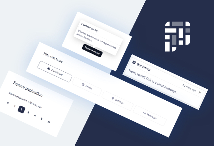
Pixel Lite Bootstrap UI Kit
Pixel Lite is a free and open source Bootstrap UI Kit featuring over 200 individual components and 6 hand-crafted pages including about, pricing, sign in and sign up pages.
Pixel comes with SASS and Gulp commands just like in this tutorial and with a couple more powerful features such as project minification and optimization based on advanced Gulp commands.
Pixel Pro Bootstrap UI Kit
Pixel Pro is a premium Bootstrap UI Kit featuring over 1000 components, 35 beautiful example pages and a user dashboard that you can use to kick-start your next project. It also comes with advanced custom SASS files and Gulp commands with fully responsive templates.
If you want to take web development to the next level you can grab Pixel Pro for just $89 dollars from Themesberg.
Thank you for reading this tutorial and let me know if you have any questions in the comment section. I’ll be more than happy to answer and help. Also make sure to check out the two Pixel projects, we worked really hard on providing high quality design and code for them for over a year now.
I also created a public repository that you can clone or download to get the project files.
Check out some awesome free and premium Bootstrap Themes, Templates and UI Kits from Themesberg.