Tutorial: how to build a simple admin dashboard interface using Bootstrap 5
Almost 2 months ago Bootstrap 5 alpha has been launched and there are two big news: jQuery has been dropped as a dependency and there is no more direct support for IE 10/11. We’ve been playing around with the new version of the framework and it is exciting to see some features such as the Utility API and working with vanilla JS.
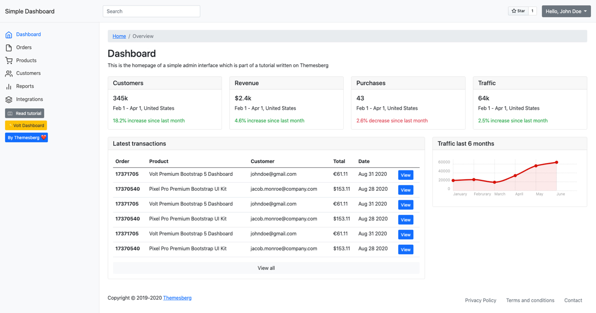
In today’s tutorial, I would like to show you guys how to create a really simple admin dashboard interface using Bootstrap 5. Here’s an online demo if you want to check it out before building it. You’ll create the following sections:
- A navigation bar with user settings;
- A sidebar with navigation items;
- A section to show the title, tagline, and breadcrumbs for the current page;
- The main content area with a couple of widget cards;
- Last of but not least a footer.
Getting started
Before you start building the interface you will need to include the following stylesheets and scripts. For simplicity, you will be using the CDN links to pull in all of the dependencies.
First of all, you should create an index.html file with the following basic markup:
<!DOCTYPE html>
<html lang="en">
<head>
    <meta charset="UTF-8">
    <meta name="viewport" content="width=device-width, initial-scale=1.0">
    <title>Bootstrap 5 Simple Admin Dashboard</title>
    <!-- insert stylesheets here -->
</head>
<body>
    <h1>Hello world!</h1>
    <!-- insert scripts here -->
</body>
</html>
Copy-paste the following stylesheet into your <head> tag:
<link rel="stylesheet" href="https://stackpath.bootstrapcdn.com/bootstrap/5.0.0-alpha1/css/bootstrap.min.css" integrity="sha384-r4NyP46KrjDleawBgD5tp8Y7UzmLA05oM1iAEQ17CSuDqnUK2+k9luXQOfXJCJ4I" crossorigin="anonymous">
The include Popper.js and the Bootstrap script file before the closing of your </body> tag:
<script src="https://cdn.jsdelivr.net/npm/[email protected]/dist/umd/popper.min.js" integrity="sha384-Q6E9RHvbIyZFJoft+2mJbHaEWldlvI9IOYy5n3zV9zzTtmI3UksdQRVvoxMfooAo" crossorigin="anonymous"></script>
<script src="https://stackpath.bootstrapcdn.com/bootstrap/5.0.0-alpha1/js/bootstrap.min.js" integrity="sha384-oesi62hOLfzrys4LxRF63OJCXdXDipiYWBnvTl9Y9/TRlw5xlKIEHpNyvvDShgf/" crossorigin="anonymous"></script>
Great! Now you have Bootstrap 5 included in our project and you can get started building the admin dashboard interface.
Navigation bar with user settings
This section will have three main parts:
- Company logo
- Search bar
- User settings
First of all you will need to create a <nav> item right after the beginning of the <body> tag. Use the following markup:
<nav class="navbar navbar-light bg-light p-3">
  <div class="d-flex col-12 col-md-3 col-lg-2 mb-2 mb-lg-0 flex-wrap flex-md-nowrap justify-content-between">
      <a class="navbar-brand" href="#">
          Simple Dashboard
      </a>
      <button class="navbar-toggler d-md-none collapsed mb-3" type="button" data-toggle="collapse" data-target="#sidebar" aria-controls="sidebar" aria-expanded="false" aria-label="Toggle navigation">
          <span class="navbar-toggler-icon"></span>
      </button>
  </div>
  <div class="col-12 col-md-4 col-lg-2">
      <input class="form-control form-control-dark" type="text" placeholder="Search" aria-label="Search">
  </div>
  <div class="col-12 col-md-5 col-lg-8 d-flex align-items-center justify-content-md-end mt-3 mt-md-0">
      <div class="mr-3 mt-1">
          <a class="github-button" href="https://github.com/themesberg/simple-bootstrap-5-dashboard" data-color-scheme="no-preference: dark; light: light; dark: light;" data-icon="octicon-star" data-size="large" data-show-count="true" aria-label="Star /themesberg/simple-bootstrap-5-dashboard">Star</a>
      </div>
      <div class="dropdown">
          <button class="btn btn-secondary dropdown-toggle" type="button" id="dropdownMenuButton" data-toggle="dropdown" aria-expanded="false">
            Hello, John Doe
          </button>
          <ul class="dropdown-menu" aria-labelledby="dropdownMenuButton">
            <li><a class="dropdown-item" href="#">Settings</a></li>
            <li><a class="dropdown-item" href="#">Messages</a></li>
            <li><a class="dropdown-item" href="#">Sign out</a></li>
          </ul>
        </div>
  </div>
</nav>
This code will create a navigation bar that will span across the whole width of the viewport. It currently has the company title/logo, a search bar, user settings dropdown, and a hamburger icon that will appear for mobile devices to toggle the sidebar links.
Creating a sidebar with navigation items
The main navigation part will be added to the sidebar and it will become toggleable using the hamburger menu on mobile devices. But before you create the sidebar you will need to set up the main content layout with a fluid container.
Add the following markup after the navigation to define the layout of the dashboard:
<div class="container-fluid">
  <div class="row">
      <nav id="sidebar" class="col-md-3 col-lg-2 d-md-block bg-light sidebar collapse">
          <!-- sidebar content goes in here -->
      </nav>
      <main class="col-md-9 ml-sm-auto col-lg-10 px-md-4 py-4">
          <h1 class="h2">Dashboard</h1>
      </main>
  </div>
</div>
Now that you have a responsive dashboard layout in place you can start building the sidebar section. Add the following markup inside the <nav> tag:
<div class="position-sticky pt-md-5">
  <ul class="nav flex-column">
      <li class="nav-item">
        <a class="nav-link active" aria-current="page" href="#">
          <svg xmlns="http://www.w3.org/2000/svg" width="24" height="24" viewBox="0 0 24 24" fill="none" stroke="currentColor" stroke-width="2" stroke-linecap="round" stroke-linejoin="round" class="feather feather-home"><path d="M3 9l9-7 9 7v11a2 2 0 0 1-2 2H5a2 2 0 0 1-2-2z"></path><polyline points="9 22 9 12 15 12 15 22"></polyline></svg>
          <span class="ml-2">Dashboard</span>
        </a>
      </li>
      <li class="nav-item">
        <a class="nav-link" href="#">
          <svg xmlns="http://www.w3.org/2000/svg" width="24" height="24" viewBox="0 0 24 24" fill="none" stroke="currentColor" stroke-width="2" stroke-linecap="round" stroke-linejoin="round" class="feather feather-file"><path d="M13 2H6a2 2 0 0 0-2 2v16a2 2 0 0 0 2 2h12a2 2 0 0 0 2-2V9z"></path><polyline points="13 2 13 9 20 9"></polyline></svg>
          <span class="ml-2">Orders</span>
        </a>
      </li>
      <li class="nav-item">
        <a class="nav-link" href="#">
          <svg xmlns="http://www.w3.org/2000/svg" width="24" height="24" viewBox="0 0 24 24" fill="none" stroke="currentColor" stroke-width="2" stroke-linecap="round" stroke-linejoin="round" class="feather feather-shopping-cart"><circle cx="9" cy="21" r="1"></circle><circle cx="20" cy="21" r="1"></circle><path d="M1 1h4l2.68 13.39a2 2 0 0 0 2 1.61h9.72a2 2 0 0 0 2-1.61L23 6H6"></path></svg>
          <span class="ml-2">Products</span>
        </a>
      </li>
      <li class="nav-item">
        <a class="nav-link" href="#">
          <svg xmlns="http://www.w3.org/2000/svg" width="24" height="24" viewBox="0 0 24 24" fill="none" stroke="currentColor" stroke-width="2" stroke-linecap="round" stroke-linejoin="round" class="feather feather-users"><path d="M17 21v-2a4 4 0 0 0-4-4H5a4 4 0 0 0-4 4v2"></path><circle cx="9" cy="7" r="4"></circle><path d="M23 21v-2a4 4 0 0 0-3-3.87"></path><path d="M16 3.13a4 4 0 0 1 0 7.75"></path></svg>
          <span class="ml-2">Customers</span>
        </a>
      </li>
      <li class="nav-item">
        <a class="nav-link" href="#">
          <svg xmlns="http://www.w3.org/2000/svg" width="24" height="24" viewBox="0 0 24 24" fill="none" stroke="currentColor" stroke-width="2" stroke-linecap="round" stroke-linejoin="round" class="feather feather-bar-chart-2"><line x1="18" y1="20" x2="18" y2="10"></line><line x1="12" y1="20" x2="12" y2="4"></line><line x1="6" y1="20" x2="6" y2="14"></line></svg>
          <span class="ml-2">Reports</span>
        </a>
      </li>
      <li class="nav-item">
        <a class="nav-link" href="#">
          <svg xmlns="http://www.w3.org/2000/svg" width="24" height="24" viewBox="0 0 24 24" fill="none" stroke="currentColor" stroke-width="2" stroke-linecap="round" stroke-linejoin="round" class="feather feather-layers"><polygon points="12 2 2 7 12 12 22 7 12 2"></polygon><polyline points="2 17 12 22 22 17"></polyline><polyline points="2 12 12 17 22 12"></polyline></svg>
          <span class="ml-2">Integrations</span>
        </a>
      </li>
    </ul>
</div>
After that either create a custom stylesheet file or create a <style> tag after the Bootstrap stylesheet and add the following styles for the sidebar:
.sidebar {
  position: fixed;
  top: 0;
  bottom: 0;
  left: 0;
  z-index: 100;
  padding: 90px 0 0;
  box-shadow: inset -1px 0 0 rgba(0, 0, 0, .1);
  z-index: 99;
}

@media (max-width: 767.98px) {
  .sidebar {
    top: 11.5rem;
    padding: 0;
  }
}

.navbar {
  box-shadow: inset 0 -1px 0 rgba(0, 0, 0, .1);
}

@media (min-width: 767.98px) {
  .navbar {
    top: 0;
    position: sticky;
    z-index: 999;
  }
}

.sidebar .nav-link {
  color: #333;
}

.sidebar .nav-link.active {
  color: #0d6efd;
}
These styles will make the sidebar stay fixed when scrolling down and also make it take up the whole height of the viewport. It also makes active navigation items stand out with a more prominent color.
Great job! Now you have the main sections of the dashboard ready: the navigation bar, the sidebar, and the main content area. Let’s continue by adding more widgets to the main content area.
Section for title, tagline, and breadcrumb
Each page from the dashboard should have a title, description, and a breadcrumb to indicate the location of the page. Just add the following markup after the beginning of the <main> tag:
<nav aria-label="breadcrumb">
  <ol class="breadcrumb">
    <li class="breadcrumb-item"><a href="#">Home</a></li>
    <li class="breadcrumb-item active" aria-current="page">Overview</li>
  </ol>
</nav>
<h1 class="h2">Dashboard</h1>
<p>This is the homepage of a simple admin interface which is part of a tutorial written on Themesberg</p>
Pretty straightforward, right? This is a great way of giving your users a good sense of where they are when navigating between pages on your dashboard.
The main content area with a couple of widget cards
From this point it’s really up to you and what exactly you want to show your users. Charts, statistics, to-do items, reminders. Usually, high-quality dashboard interfaces use building blocks called widgets to organize various metrics. Let’s start by creating such an element:
<div class="card">
  <h5 class="card-header">Customers</h5>
  <div class="card-body">
    <h5 class="card-title">345k</h5>
    <p class="card-text">Feb 1 - Apr 1, United States</p>
    <p class="card-text text-success">18.2% increase since last month</p>
  </div>
</div>
Let’s continue by adding four of these right under the title:
<div class="row my-4">
  <div class="col-12 col-md-6 col-lg-3 mb-4 mb-lg-0">
      <div class="card">
          <h5 class="card-header">Customers</h5>
          <div class="card-body">
            <h5 class="card-title">345k</h5>
            <p class="card-text">Feb 1 - Apr 1, United States</p>
            <p class="card-text text-success">18.2% increase since last month</p>
          </div>
        </div>
  </div>
  <div class="col-12 col-md-6 mb-4 mb-lg-0 col-lg-3">
      <div class="card">
          <h5 class="card-header">Revenue</h5>
          <div class="card-body">
            <h5 class="card-title">$2.4k</h5>
            <p class="card-text">Feb 1 - Apr 1, United States</p>
            <p class="card-text text-success">4.6% increase since last month</p>
          </div>
        </div>
  </div>
  <div class="col-12 col-md-6 mb-4 mb-lg-0 col-lg-3">
      <div class="card">
          <h5 class="card-header">Purchases</h5>
          <div class="card-body">
            <h5 class="card-title">43</h5>
            <p class="card-text">Feb 1 - Apr 1, United States</p>
            <p class="card-text text-danger">2.6% decrease since last month</p>
          </div>
        </div>
  </div>
  <div class="col-12 col-md-6 mb-4 mb-lg-0 col-lg-3">
      <div class="card">
          <h5 class="card-header">Traffic</h5>
          <div class="card-body">
            <h5 class="card-title">64k</h5>
            <p class="card-text">Feb 1 - Apr 1, United States</p>
            <p class="card-text text-success">2.5% increase since last month</p>
          </div>
        </div>
  </div>
</div>
Let’s continue by creating another widget which has a table of showing the latest purchases made for your business:
<div class="row">
  <div class="col-12 col-xl-8 mb-4 mb-lg-0">
      <div class="card">
          <h5 class="card-header">Latest transactions</h5>
          <div class="card-body">
              <div class="table-responsive">
                  <table class="table">
                      <thead>
                        <tr>
                          <th scope="col">Order</th>
                          <th scope="col">Product</th>
                          <th scope="col">Customer</th>
                          <th scope="col">Total</th>
                          <th scope="col">Date</th>
                          <th scope="col"></th>
                        </tr>
                      </thead>
                      <tbody>
                        <tr>
                          <th scope="row">17371705</th>
                          <td>Volt Premium Bootstrap 5 Dashboard</td>
                          <td>[email protected]</td>
                          <td>€61.11</td>
                          <td>Aug 31 2020</td>
                          <td><a href="#" class="btn btn-sm btn-primary">View</a></td>
                        </tr>
                        <tr>
                          <th scope="row">17370540</th>
                          <td>Pixel Pro Premium Bootstrap UI Kit</td>
                          <td>[email protected]</td>
                          <td>$153.11</td>
                          <td>Aug 28 2020</td>
                          <td><a href="#" class="btn btn-sm btn-primary">View</a></td>
                        </tr>
                        <tr>
                          <th scope="row">17371705</th>
                          <td>Volt Premium Bootstrap 5 Dashboard</td>
                          <td>[email protected]</td>
                          <td>€61.11</td>
                          <td>Aug 31 2020</td>
                          <td><a href="#" class="btn btn-sm btn-primary">View</a></td>
                        </tr>
                        <tr>
                          <th scope="row">17370540</th>
                          <td>Pixel Pro Premium Bootstrap UI Kit</td>
                          <td>[email protected]</td>
                          <td>$153.11</td>
                          <td>Aug 28 2020</td>
                          <td><a href="#" class="btn btn-sm btn-primary">View</a></td>
                        </tr>
                      </tbody>
                    </table>
              </div>
                <a href="#" class="btn btn-block btn-light">View all</a>
          </div>
      </div>
  </div>
  <div class="col-12 col-xl-4">
      <!-- Another widget will go here -->
  </div>
</div>
Awesome! Now you also have a widget with a table where you can add things such as users, transactions, and so on.
The last widget that you will create in this tutorial will be one having a chart. We love using Chartist for our themes because it’s open-source, lightweight, and responsive.
To start using Chartist you need to include the following stylesheet in your <head> tag:
<link rel="stylesheet" href="https://cdn.jsdelivr.net/chartist.js/latest/chartist.min.css">
Then include the following script before the end of your <body> tag:
<script src="https://cdn.jsdelivr.net/chartist.js/latest/chartist.min.js"></script>
Now that you have Chartist included just add the following markup inside the <div class=”col-12 col-lg-4”> element:
<div class="card">
  <h5 class="card-header">Traffic last 6 months</h5>
  <div class="card-body">
      <div id="traffic-chart"></div>
  </div>
</div>
And either create a custom javascript file or a script tag and initialize it:
new Chartist.Line('#traffic-chart', {
    labels: ['January', 'Februrary', 'March', 'April', 'May', 'June'],
    series: [
      [23000, 25000, 19000, 34000, 56000, 64000]
    ]
  }, {
  low: 0,
  showArea: true
});
Awesome! You have created 3 types of widgets for your dashboard that you can use to indicate many types of data. Let’s continue with the last section of the dashboard, the footer.
Building the footer
The footer of the dashboard is a good way to show a reference to less navigated pages, such as privacy policy, terms of the agreement, contact, and so on. Add the following markup before the end of the <main> tag:
<footer class="pt-5 d-flex justify-content-between">
  <span>Copyright © 2019-2020 <a href="https://themesberg.com">Themesberg</a></span>
  <ul class="nav m-0">
      <li class="nav-item">
        <a class="nav-link text-secondary" aria-current="page" href="#">Privacy Policy</a>
      </li>
      <li class="nav-item">
        <a class="nav-link text-secondary" href="#">Terms and conditions</a>
      </li>
      <li class="nav-item">
        <a class="nav-link text-secondary" href="#">Contact</a>
      </li>
    </ul>
</footer>
Congratulations! Now you have finished building a simple admin dashboard interface using Bootstrap 5. If you want to access the tutorial files just clone the public repository and give it a star to spread the open-source love ❤️.
Before you go, allow me to introduce a project that we’ve been working on at Themesberg. It’s called Volt and it is a free and open-source Bootstrap 5 Admin Dashboard that has been styled by professional designers and has quite a few more features that the dashboard that we have built for this tutorial.
Volt - Free Bootstrap 5 Admin Dashboard
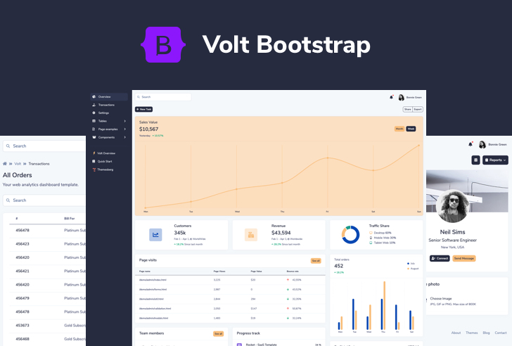
It features over 100 Bootstrap 5 components, 11 example pages, and 3 plugins. We also included Sass files and an advanced Gulp command system which lets you create a local server using BrowserSync and watch for file changes as you develop.
Last week it became trending on Product Hunt and the best news is that it is completely free to use.
Alternatively, you can also opt-in for a more professional version of Volt which has 20 example pages, over 800 components, and 10 plugins that can bring your dashboard interface to the next level.
Volt - Premium Bootstrap 5 Dashboard

You can consider Volt Pro to be a pro extension of the free version having 3x more components, pages, and plugins that you can work with. By purchasing it for only $59 you will get at least 6 months of premium support and free updates.