React Dashboard Tutorial - Learn how to get started with an admin interface built with React.js and Bootstrap 5
In this tutorial, I would like to show you how to start building interactive web applications using a React dashboard written in React.js and the latest version of Bootstrap 5. At the end of this, you’ll know how to create pages, use and create React components, and customize the appearance of the application.
Before we get started, let me introduce you to the two main technologies that you’ll use during this tutorial.
React.js
React is one of the most popular web frontend libraries in the world, hitting almost 30 million downloads every month according to the NPM trends tracker. It is a declarative and component-based library, making use of the so-called state to propagate changes throughout the components of your application.
Bootstrap 5
You’ve probably heard of the most popular CSS framework in the world, called Bootstrap. But you may not know that a couple of months ago, a new version of Bootstrap was released, dropping jQuery as a dependency, introducing RTL support, the utility API, and improvements regarding the styles and markup. We also wrote an extensive tutorial about Bootstrap 5 if you’d like to learn more about it.
Here’s the table of contents for this tutorial in React.js:
- Download and install Volt React Dashboard
- Learn the folder structure
- Explore the React UI components
- Build a new page
- Customize using Sass variables
- Build your code and upload it to the server
- Conclusion
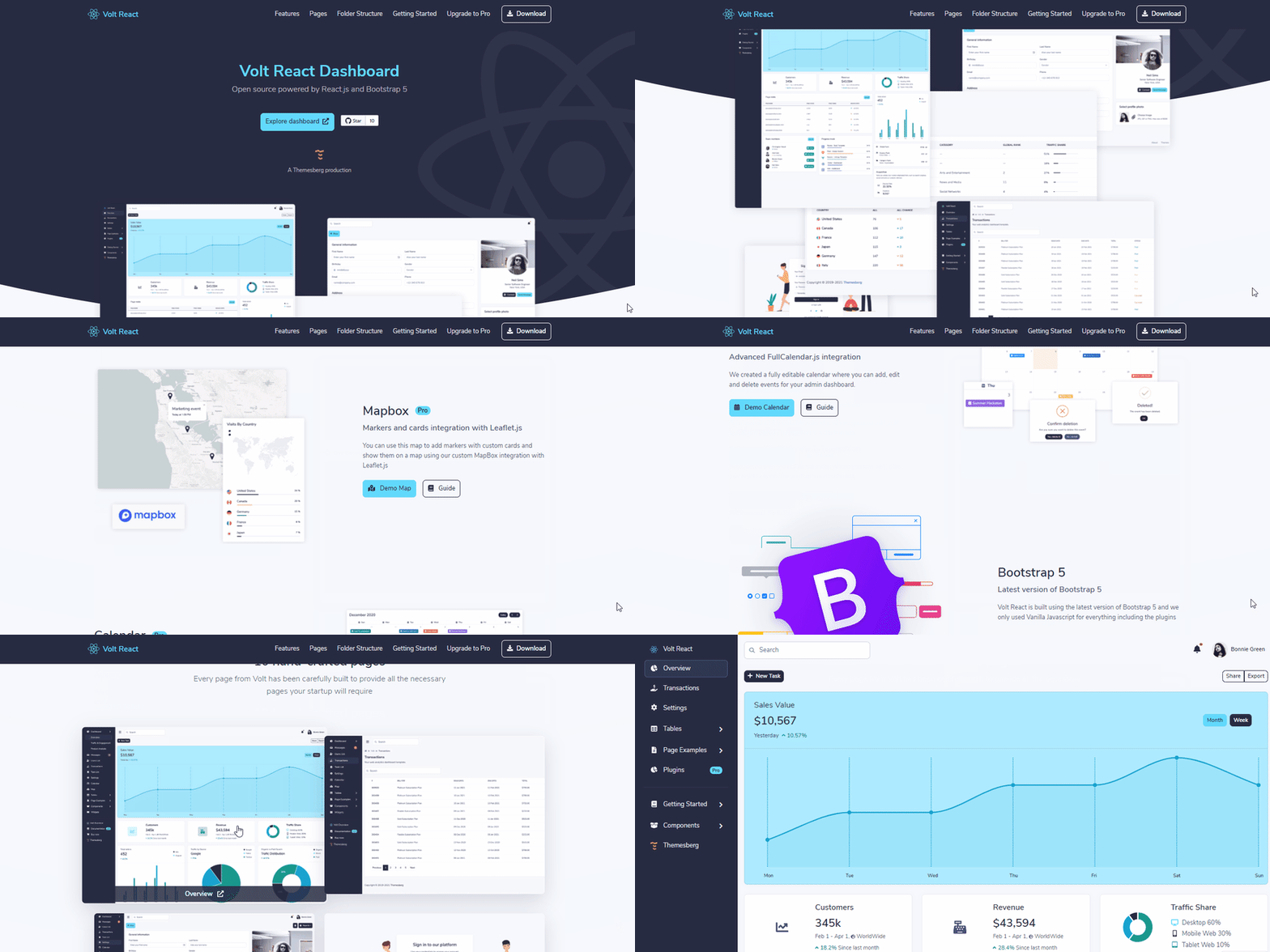
As the starting point for this tutorial, we will use a free and open-source admin dashboard template that we’ve built here at Themesberg. It is built using the two technologies mentioned above: React.js and Bootstrap 5.
Download and install Volt React Dashboard
The first step to make in this tutorial is to download the base project that we’re going to use, which is an admin dashboard interface built with React.js and Bootstrap 5. You can either create a free account at Themesberg and download it directly, or clone the project from the official Github repository.
After you’ve unzipped the file (if you’ve downloaded it), use the terminal and go to the root project folder. We’re going to use “yarn” in this tutorial to install the dependencies and work with the project.
Step 1: Install project dependencies
After you’ve successfully installed Yarn, run the following command to install the project dependencies:
yarn install
This will install third party libraries, such as React, Bootstrap, and other projects that are needed for this project.
Step 2: Run development mode
Now that you have installed the dependencies, you can get started working with the dashboard. But first, you need to run the following command:
yarn start
This will open a local development server where your changes will be reflected and compiled. A new window will open up in your default browser at the http://localhost:3000 address. If that does not happen automatically, just write it in the browser bar.
If you prefer using NPM instead of Yarn, you can follow the instructions from the official repository on how to install Volt React Dashboard via NPM.
Learn the project structure
Before we start building new components and writing code, let’s first explore the project files and understand what happens under the hood:
public/: this folder contains the index.html file where the compiled Javascript is included, and also where you can tweak the page attributes, such as the title, attribute, favicon, and many other. You can also add assets such as images here, but we recommend including assets via the import feature from the src/ folder;src/: in this folder you will be writing most of the code as it is the source of the application you’re building. Assets, components, data, pages, routing, and even the stylesheets can be found here;src/assets/: this is the folder where you should include images, fonts, and any other static assets that you’ll be importing into your app;src/components/: in this folder we recommend building new components that you will use as UI elements throughout your project;src/data/: this is the folder where the data should come from, and although on the official repository there’s only dummy data available as arrays of objects, the data folder should contain the API calls for the backend of your application;src/pages/: this folder contains the pages of your application which are registered as routes in the routes.js file;src/scss/: here you can write and modify the stylesheet of your application, but also change the Sass variables and mixins to easily change the appearance of the project seamlessly;src/index.js: this is the main wrapper file where the routing and the base layout of the project is sticked together;src/routes.js: this is the file where you first declare the routes of the application, and later register in the Homepage.js component which will render from the index.js file;package.json: this is an important file that contains the project dependencies, the base URL for the project when building the production code, and also some useful scripts that you can use via NPM;node_modules/: this is the folder where all dependencies will be installed after running yarn install;.gitignore: here you can add files or folders to be ignored by the git version control system, such as the node_modules folder.
Now that we’ve broken down the folder structure and briefly explained what each folder and file does, let’s continue with the tutorial and start by creating a new React component.
Explore the React UI components
The reason why I chose the Volt React Dashboard project for this tutorial is because of the vast amount of UI components and pages that you can use right away to build new pages and interfaces, without having to built it yourself beforehand.
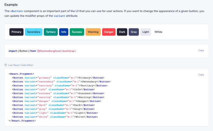
To start exploring the UI elements of this project, just go the the components sidebar item, and then you can see all of the components, such as accordions, buttons, alerts, modals, and many more. You can check out the example of the button components from the example above.
I recommend you taking your time and check out all of the components, read the documentation, and also play around with the code. As you can see, the examples are editable and the changes will be reflected in the rendered box just below the explanatory text.
For example, try changing the variant attribute of the first button from primary to secondary, and you’ll see that the first button will also become blue, like the second one. This will give you a good idea how easy it is to work with these UI elements down the road.
Build a new page
After you have explored the UI components, it’s time to show you how you can create a brand new page, add new components to it, register it as a route and add it to the sidebar. You’ll build a page which will show a list of users.
Step 1: create a new file
The first step is to create a new file inside the pages/ folder and call it Users.js. Create a new class inside this file and import React:
import React from "react";

export default () => {
    return (
        <></>
    );
};
Step 2: declare and register it a route
Now let’s register as a route. Go to the routes.js file inside the src folder and add the following line into the Routes constant:
Settings: { path: "/settings" },
Upgrade: { path: "/upgrade" },
Users: { path: "/users" }, // add it here
BootstrapTables: { path: "/tables/bootstrap-tables" },
Billing: { path: "/examples/billing" },
Now go to the Homepage.js file located in the src/pages/ folder and import the Users.js file and declare a new <RouteWithSidebar> component inside the render method of the Homepage component, connecting the Users component with the routing option from route.js:
// import at the top of Homepage.js
import Users from "./Users";
And in the render method:
<RouteWithSidebar exact path={Routes.Settings.path} component={Settings} />
<RouteWithSidebar exact path={Routes.Users.path} component={Users} /> {/* register this new route */}
<RouteWithSidebar exact path={Routes.BootstrapTables.path} component={BootstrapTables} />
If you now go to the page at http://localhost:3000/#/users you will see a blank new page with a sidebar, the navigation, and the footer.
Step 3: build the page using React components
Great job! Now that you have created a new page, you’re free to build it however you want it using the UI elements that are provided with the Volt React Dashboard project. The page needs a title, a description, and some breadcrumb elements. Add the following code inside the render method of the Users component:
<div className="d-lg-flex justify-content-between flex-wrap flex-md-nowrap align-items-center py-4">
    <div className="mb-4 mb-lg-0">
        <Breadcrumb className="d-none d-md-inline-block" listProps={{ className: "breadcrumb-dark breadcrumb-transparent" }}>
            <Breadcrumb.Item><FontAwesomeIcon icon={faHome} /></Breadcrumb.Item>
            <Breadcrumb.Item>Volt</Breadcrumb.Item>
            <Breadcrumb.Item active>Users List</Breadcrumb.Item>
        </Breadcrumb>
        <h4>Users List</h4>
        <p className="mb-0">Your web analytics dashboard template.</p>
    </div>
</div>
If you go to the browser, you’ll see a few error messages saying that certain components are not defined. All you need to do is import those components at the top of the file:
import React from "react";
import { Breadcrumb } from "@themesberg/react-bootstrap";
import { FontAwesomeIcon } from '@fortawesome/react-fontawesome';
import { faHome } from '@fortawesome/free-solid-svg-icons';

If you now head back to the browser, you’ll see that a breadcrumb component, title, and a description has been added to the page.
Let’s continue by adding a few elements that will let you to search, update, or add new users to the list:
<div className="d-lg-flex justify-content-between flex-wrap flex-md-nowrap align-items-center py-4">
    <div className="mb-4 mb-lg-0">
        <Breadcrumb className="d-none d-md-inline-block" listProps={{ className: "breadcrumb-dark breadcrumb-transparent" }}>
            <Breadcrumb.Item><FontAwesomeIcon icon={faHome} /></Breadcrumb.Item>
            <Breadcrumb.Item>Volt</Breadcrumb.Item>
            <Breadcrumb.Item active>Users List</Breadcrumb.Item>
        </Breadcrumb>
        <h4>Users List</h4>
        <p className="mb-0">Your web analytics dashboard template.</p>
    </div>
    <div className="btn-toolbar mb-2 mb-md-0">
        <Button variant="primary" size="sm">
            <FontAwesomeIcon icon={faPlus} className="me-2" /> Add New User
        </Button>
        <ButtonGroup className="ms-3">
            <Button variant="outline-primary" size="sm">Share</Button>
            <Button variant="outline-primary" size="sm">Export</Button>
        </ButtonGroup>
    </div>
</div>
Don’t forget to keep importing the components:
import React from "react";
import { Breadcrumb, Button, ButtonGroup } from "@themesberg/react-bootstrap";
import { FontAwesomeIcon } from '@fortawesome/react-fontawesome';
import { faHome, faPlus } from '@fortawesome/free-solid-svg-icons';
Let’s continue by making use of the Bootstrap grid system and add a search form input, a dropdown element, and two icon dropdown items below the other elements:
<div className="table-settings mb-4">
    <Row className="justify-content-between align-items-center">
        <Col xs={9} lg={4} className="d-flex">
            <InputGroup className="me-2 me-lg-3">
                <InputGroup.Text>
                    <FontAwesomeIcon icon={faSearch} />
                </InputGroup.Text>
                <Form.Control type="text" placeholder="Search" />
            </InputGroup>
            <Form.Select className="w-25">
                <option defaultChecked>All</option>
                <option value="1">Active</option>
                <option value="2">Inactive</option>
                <option value="3">Pending</option>
                <option value="3">Canceled</option>
            </Form.Select>
        </Col>
        <Col xs={3} lg={8} className="text-end">
            <Dropdown as={ButtonGroup} className="me-2">
                <Dropdown.Toggle split as={Button} variant="link" className="text-dark m-0 p-0">
                    <span className="icon icon-sm icon-gray">
                        <FontAwesomeIcon icon={faSlidersH} />
                    </span>
                </Dropdown.Toggle>
                <Dropdown.Menu className="dropdown-menu-right">
                    <Dropdown.Item className="fw-bold text-dark">Show</Dropdown.Item>
                    <Dropdown.Item className="d-flex fw-bold">
                        10 <span className="icon icon-small ms-auto"><FontAwesomeIcon icon={faCheck} /></span>
                    </Dropdown.Item>
                    <Dropdown.Item className="fw-bold">20</Dropdown.Item>
                    <Dropdown.Item className="fw-bold">30</Dropdown.Item>
                </Dropdown.Menu>
            </Dropdown>
            <Dropdown as={ButtonGroup}>
                <Dropdown.Toggle split as={Button} variant="link" className="text-dark m-0 p-0">
                    <span className="icon icon-sm icon-gray">
                        <FontAwesomeIcon icon={faCog} />
                    </span>
                </Dropdown.Toggle>
                <Dropdown.Menu className="dropdown-menu-right">
                    <Dropdown.Item className="fw-bold text-dark">Show</Dropdown.Item>
                    <Dropdown.Item className="d-flex fw-bold">
                        10 <span className="icon icon-small ms-auto"><FontAwesomeIcon icon={faCheck} /></span>
                    </Dropdown.Item>
                    <Dropdown.Item className="fw-bold">20</Dropdown.Item>
                    <Dropdown.Item className="fw-bold">30</Dropdown.Item>
                </Dropdown.Menu>
            </Dropdown>
        </Col>
    </Row>
</div>
The imports should look like this:
import React from "react";
import { Breadcrumb, Button, ButtonGroup, Row, Col, InputGroup, Form, Dropdown } from "@themesberg/react-bootstrap";
import { FontAwesomeIcon } from '@fortawesome/react-fontawesome';
import { faHome, faPlus, faCog, faCheck, faSearch, faSlidersH } from '@fortawesome/free-solid-svg-icons';
Great job! Now you’ve added all of the essential elements for the top side of this page. The result should look like the following image in your browser.

What we now have to do is create elements that will show each user, showing their avatar, name, email, and position at the company. Let’s start by creating an table without any rows:
<Card border="light" className="table-wrapper table-responsive shadow-sm">
    <Card.Body>
        <Table hover className="user-table align-items-center">
            <thead>
                <tr>
                    <th className="border-bottom">Name</th>
                    <th className="border-bottom">Email</th>
                    <th className="border-bottom">Position</th>
                    <th className="border-bottom">User Created at</th>
                </tr>
            </thead>
            <tbody>

            </tbody>
        </Table>
    </Card.Body>
</Card>
Add the following imports to make sure all components are included:
import React from "react";
import { Breadcrumb, Button, ButtonGroup, Row, Col, InputGroup, Form, Dropdown, Card, Table } from "@themesberg/react-bootstrap";
import { FontAwesomeIcon } from '@fortawesome/react-fontawesome';
import { faHome, faPlus, faCog, faCheck, faSearch, faSlidersH } from '@fortawesome/free-solid-svg-icons';
The result should look like this:

Let’s add a single row of a user with the appropriate values. Add the following code inside the <tbody> element:
What we now have to do is create elements that will show each user, showing their avatar, name, email, and position at the company. Let’s start by creating an empty table:
<tr>
    <td>
        <Card.Link className="d-flex align-items-center">
            <Image src={Thomas} className="user-avatar rounded-circle me-3" />
            <div className="d-block">
                <span className="fw-bold">Thomas Shelby</span>
            </div>
        </Card.Link>
    </td>
    <td>[email protected]</td>
    <td>Boss</td>
    <td>January 20, 1921</td>
</tr>
Don’t forget to add to add the imports:
import React from "react";
import { Breadcrumb, Button, ButtonGroup, Row, Col, InputGroup, Form, Image, Dropdown, Card, Table } from "@themesberg/react-bootstrap";
import { FontAwesomeIcon } from '@fortawesome/react-fontawesome';
import { faHome, faPlus, faCog, faCheck, faSearch, faSlidersH } from '@fortawesome/free-solid-svg-icons';
import Thomas from "../assets/img/team/thomas.jpg"
We’ve downloaded an image for our favourite character from the Peaky Blinders. You can choose your own character, but make sure to add it to the assets/img/team folder and import it accordingly in the Users.js file.
The result should look something like this:
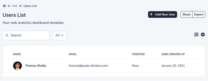
Awesome! We now have one user in the table. But the problem is that there may be many more users in time, and it’s probably not a very smart way to manually write this code in the render method of the component, so it should come from a data source, preferably an API. In this example, we’ll only use an array of objects, but normally it should come from a database.
Create a new file called users.js in the data folder and add the following code:
import Thomas from "../assets/img/team/thomas.jpg"
import Arthur from "../assets/img/team/arthur.jpg"
import Polly from "../assets/img/team/polly.jpeg"
import John from "../assets/img/team/john.jpeg"
import Grace from "../assets/img/team/grace.jpg"

export default [
    {
        "key": 1,
        "image": Thomas,
        "name": "Thomas Shelby",
        "email": "[email protected]",
        "position": "Boss",
        "dateCreated": "January 20, 1921",
    },
    {
        "key": 2,
        "image": Arthur,
        "name": "Arthur Shelby",
        "position": "Second boss",
        "email": "[email protected]",
        "dateCreated": "March 20, 1917",
    },
    {
        "key": 3,
        "image": Polly,
        "name": "Polly Gray",
        "position": "Company treasurer",
        "email": "[email protected]",
        "dateCreated": "March 20, 1912",
    },
    {
        "key": 4,
        "image": John,
        "name": "John Shelby",
        "position": "Fixer",
        "email": "[email protected]",
        "dateCreated": "December 20, 1924",
    },
    {
        "key": 5,
        "image": Grace,
        "name": "Grace Shelby",
        "position": "Miscellaneous",
        "email": "[email protected]",
        "dateCreated": "April 20, 1921",
    },
];
Then, import this data inside the Users.js file like this:
import users from '../data/users';
Then we need to iterate through the users array and inject the variables inside the appropriate table data elements. Add the following code instead of the previous <tr> element with Thomas:
{users.map(u => (
    <tr key={u.key}>
        <td>
            <Card.Link className="d-flex align-items-center">
                <Image src={u.image} className="user-avatar rounded-circle me-3" />
                <div className="d-block">
                    <span className="fw-bold">{u.name}</span>

                </div>
            </Card.Link>
        </td>
        <td><span className="fw-normal"><div className="small text-gray">{u.email}</div></span></td>
        <td><span className="fw-normal"><div className="small text-gray">{u.position}</div></span></td>
        <td><span className="fw-normal">{u.dateCreated}</span></td>
    </tr>
))}
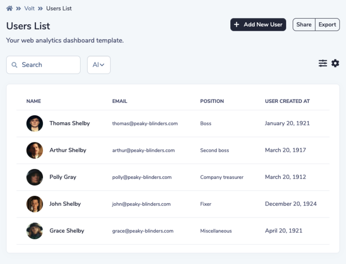
What we do here is that the users.map method will iterate through every user from the data/users.js dataset, and create a new table row element for each user available, while adding the data in the corresponding table data element. The result should look like this:

Congratulations! Now you’ve learned how to build a new page, a data source, and show multiple users using React components and from a data source.
In the next section I’ll show you how easy it is to change the appearance of the dashboard using Sass variables.
Customize using Sass variables
You’ll most likely want to update the appearance of the application, such as the colors, the font family, and some other things. Fortunately, this can be done quite easily because of the Sass source files. Let’s change the blue color to a red one.
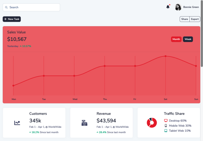
Go to the src/scss/volt/_variables.scss and update the following values:
$secondary:     #E2252B;

$ct-series-colors: (
    #E2252B,
    #E2252B,
    #262B40,
    #f5b759,
    #C96480,
    #ffffff,
    #E2252B,
);
All you need to do is save the file, go to your browser and see every instance of blue color now turn red, even the charts. Amazing, right? You can change many other options using the variables, but you can also write new styles as well.
Build your code and upload it to the server
You’ve installed the project, created a new page, used data sources and even customized the appearance of the project. But that’s not going to help too much if you can’t upload it online, so that everyone can see your great work, right?
All you need to do to create the final project is update the homepage value inside the package.json file to be equal with the domain path that you’ll have:
"homepage": "https://demo.themesberg.com/volt-react-dashboard",
In our case, we’ve uploaded it to a subdirectory of the demo.themesberg.com subdomain, but it can be something like example.com as well.
Then you need to run the following command in the terminal:
yarn build
This will create a new folder called build. You need to take the contents of that folder and upload it to your server. That’s it.
Conclusion
Congratulations! You’ve learned how to install a React project, build a new page, customize the Sass variables and build the final production files. I hope you learned a lot and that the dashboard will help you with your frontend development career and projects.
Before you go, I’d like to introduce you to a premium version of the Volt React Dashboard, which has twice as many components, pages, plugins and a few more features compared to the open source version of it.
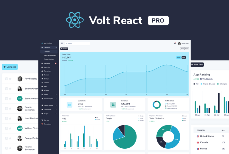
Volt Pro React Dashboard is a premium admin dashboard template built on top of the most popular front-end library in the world called React.js and the UI elements are based on the latest version of Bootstrap 5. It features over 200 React components, customized plugins, and example pages that you can use to kick-start your web app development.
