How to create neumorphism web components/elements with only CSS and HTML
In this tutorial I want to show you guys how to create neumorphic elements using only CSS and HTML. Neumorphism is a controversial design trend which started in late 2019. It has its ups and downs and although it probably won’t become a widely used design trend, I believe that certain types of websites, such as art & futuristic related industries could use neumorphism.

Before we dive into the steps on creating neumorphic elements, I’d like to present to you some of the rules that you should follow when creating your components.
- Elements such as buttons, cards should all have two opposing shadows: one light and one dark;
- The background color of the element should be the same or very similar to the background color of the body in general;
- Elements should be rounded and not squared (ie. border-radius);
- Element borders should be non existing or at most subtle;
- Although gray is the original color of neumorphism, you can use any color you like (dark modes are also great);
- You can choose a secondary color to highlight text & icon color inside the elements.
Following the guidelines above we will create a button element using only CSS and HTML.
Step 1: creating a button tag element in HTML
In this step all we need to do is create the appropriate button element and create a class which we will later use to add styles to. Here’s the markup we used:
<button class="button">Neumorphic button</button>
Step 2: add some basic styles like padding and background color
Let’s choose a shade of gray for this tutorial. This will act as our primary color for both the body background and the elements. Let’s start by adding a body color:
body {
  background-color: #E6E7EE;
}
The button looks a bit HTML’ish now. Let’s make it prettier:
.button {
  background-color: #E6E7EE;
  border: 1px solid #d1d9e6;
  border-radius: 5px;
  font-size: 16px;
  padding: 10px 20px;
}
Step 3: create a class to add the neumorphic double shadows
Because the double shadow can be used for multiple elements and not only buttons, it is a good idea to create a separate class that you can use for any component. The you need to add the following box-shadow properties:
.neumorphic-shadows {
  -webkit-box-shadow: 3px 3px 6px #b8b9be, -3px -3px 6px #fff;
        box-shadow: 3px 3px 6px #b8b9be, -3px -3px 6px #fff;
}
Also don’t forget to add the .neumorphic-shadows class to your button element like this:
<button class="button neumorphic-shadows">Neumorphic button</button>
We’re almost ready, but something is still missing. It would be really cool to have a hover and active effect for the button.
Step 4: adding an inverted shadow hover effect
We recommend using the inverted shadow effect for elements such as buttons when hovering over. Create the following class and styles:
.neumorphic-shadows-hover:hover {
  cursor: pointer;
  -webkit-box-shadow: inset 2px 2px 5px #b8b9be, inset -3px -3px 7px #fff;
        box-shadow: inset 2px 2px 5px #b8b9be, inset -3px -3px 7px #fff;
}
Then add the .neumorphic-shadows-hover class to your button. The reason we created a separate class is because we don’t want to limit this only to button elements, but we also don’t want to use the hover instance for our base .neumorphic-shadows element because some components don’t need a hover effect.
<button class="button neumorphic-shadows neumorphic-shadows-hover">Neumorphic button</button>
That’s it! You can now use the neumorphic shadow classes for any type of component you want to build, such as cards, badges, menu items and so on. Here’s the full code that we used on Codepen:
See the Pen Neumorphic Button Example by Themesberg by Themesberg (@themesberg) on CodePen.
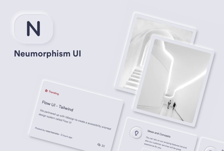
Last week we created a complete set of neumorphic web components and elements called Neumorphism UI.
Neumorphism UI by Themesberg
Neumorphism UI is a free and open source Bootstrap UI Kit featuring over 200 individual components and 5 example pages including pricing, contact and user login/registration pages.
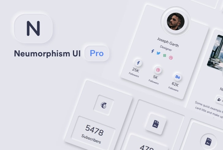
Neumorphism UI PRO by Themesberg
If you would like to take neumorphism to the next level, we also created a pro version of Neumorphism UI which has 5 times more components and 13 example pages. It only costs $69 and you get 6 months of premium support and free updates.
Share your thoughts on neumorphism in the comments section. Personally I know it’s a controversial design trend and by no means do I recommend using these styles for all projects, but I think you can give it a try.
Check out some awesome free and premium Bootstrap Themes, Templates and UI Kits from Themesberg.

