How we redesigned our product page and improved page value based on Google Analytics
As we are a business selling digital products - namely Bootstrap Themes - it is mandatory for us to have a well structured product page. We decided to radically change the layout as we felt it was way too clustered and there was too much information that we served to the visitor right away. In fact our first draft was very similar to what the official Bootstrap Themes store has right now.

Don’t get me wrong, we didn’t get any complaints about how the page looked or behaved, but we thought we could give it a really nice facelift and maybe even throw in a couple of things that other websites don’t have. And so we did.
So let me first present you the minimal viable information a product from Themesberg has:
- Product title
- Product tagline
- Preview image
- Live preview action button
- Documentation action button
- Purchase action (we have 2 licenses so this was the tricky part)
Of course we had more information about the product such as a longer description, created & updates dates, technologies used, version number and so on. The list above is the information that we wanted to present above the fold so the visitor can understand what the page is about in less than 3 seconds.
I want to structure this article into two parts, based on what design changes & new information we added and how the user behaviour statistics have improved following the upgrade.
A welcoming design to highlight the important bits
This was probably the toughest part mostly because this time we did not want to get inspired from other websites. All we did is we took a pen and a paper and started creating various wireframes.
First of all, we wanted to keep only the most viable information at the top of the page. What this meant is that the elements would be slightly larger and make use of bigger spaces to better highlight the important elements.
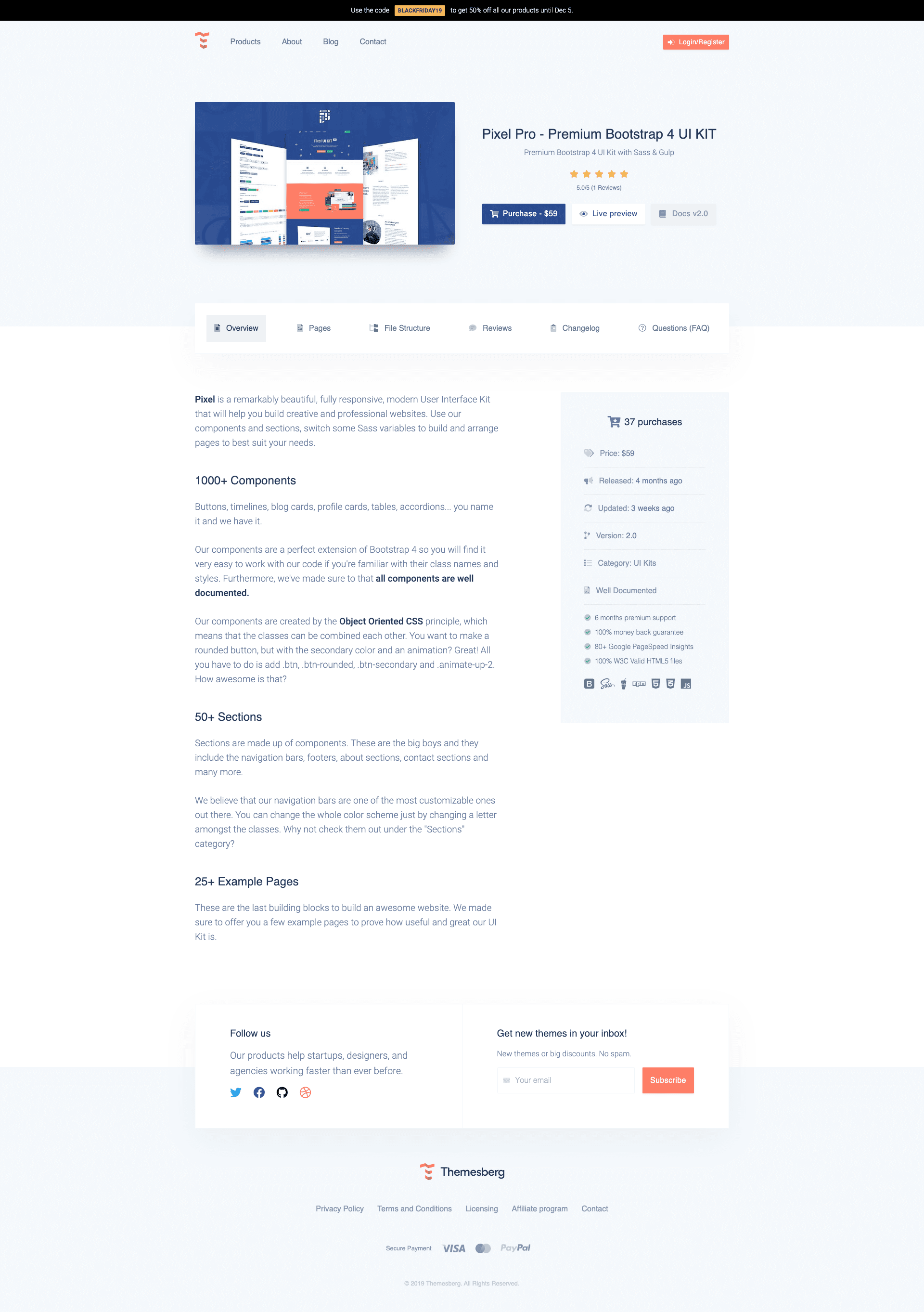 New Product Page
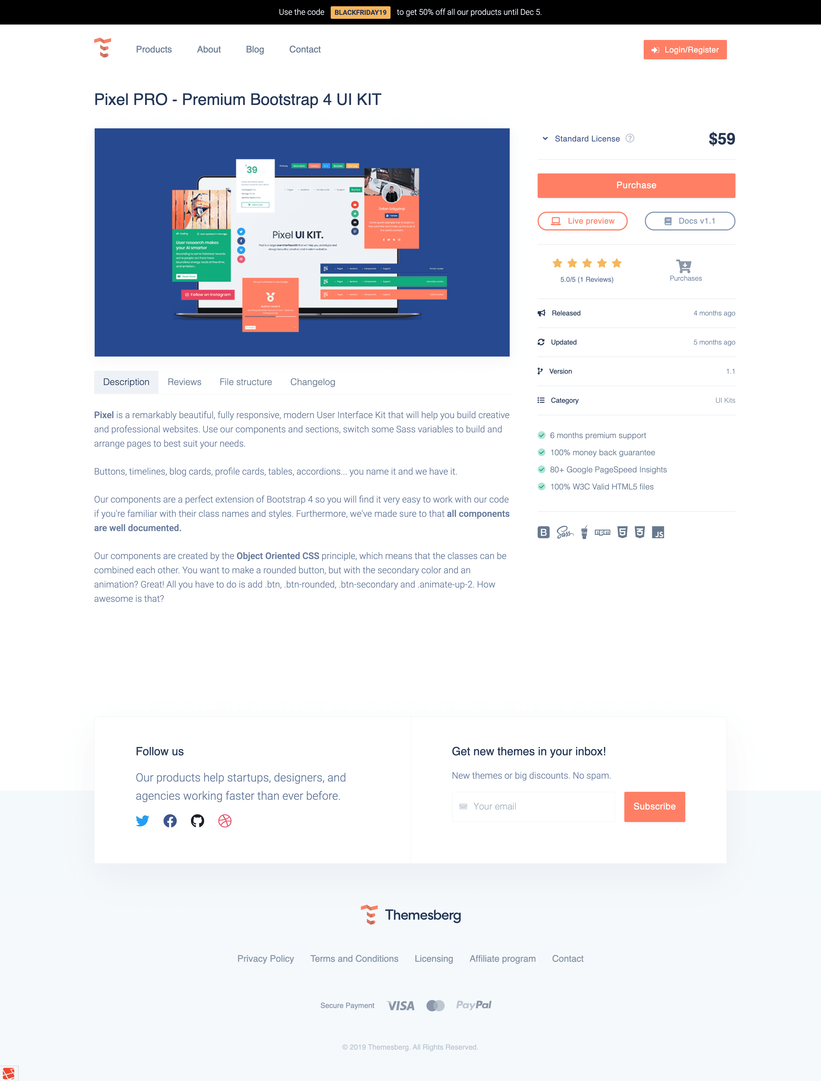 Old Product Page
All of our themes have a live preview functionality and we believe giving access to the user fast and simple is of the utmost importance. That is why we actually have two actions leading to the Live Preview state: first by hovering over the preview image and clicking on the icon button in the middle and second by clicking on the button in the middle on the right side.
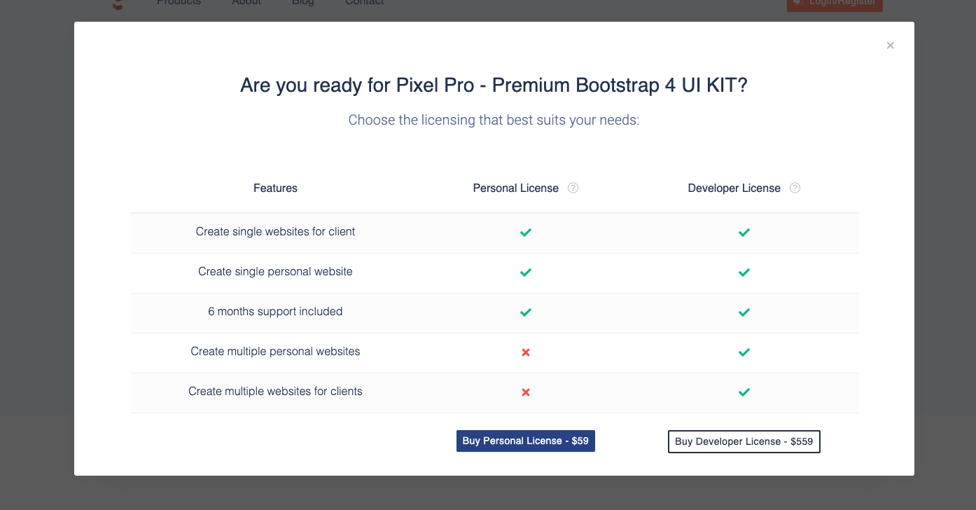
The second most important action on this page is the purchase and licensing information. All of our products have two licenses: personal and developer. I’m not going to go into what each of them mean, however it is important to make the potential client thoroughly understand what he is allowed to do and choose the license which best suits his needs.
 New Product Page
 Old Product Page
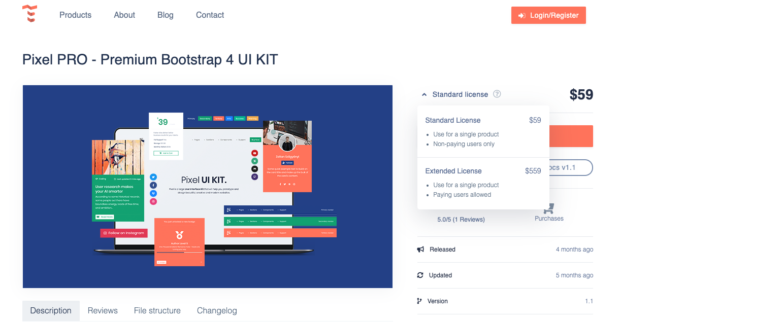
In the old design we had a dropdown toggle which opened up and based on which option the user chose, the price would change in the right in the right side. This was okay, however we barely showed any information about the licenses right away and many users did not even know there was another license for the products. Of course we still had the question mark linking back to our main Licensing page, however based on our heatmaps it was rarely used.
Comparatively the new design shows by default the price based on the cheapest license and when the user click on the Purchase button a large modal is opened up with a table comparing the two licenses based on the most important aspects with prices included. After this change we saw a nice increase in the amount of Developer licenses being purchased.
The other secondary elements such as the reviews, title, tag lines and documentation link have been properly aligned and positioned next to the other more important elements.
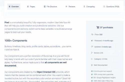
Now that we have finished analyzing the first part of the page let’s get into the remaining sections. Previously we had the following remaining information:
- Release & Updated date, Version number, Category, number of purchases or download
- A small list of advantages
- List of technologies used
- Long description
- List of reviews
- File structure
- Changelog
Of course the old design also had quite a lot of information already, but we decided to add two more sections: pages and FAQ.
The sections that already existed have been redesigned and some of the data have been brought down below the fold (eg. release date, number of purchases). As now there was more space left for the content below the tabs the font size and all elements got slightly larger and more readable.
We are the only website showing the exact file structure outside of the readme.MD or documentation of our products and even though it takes a bit more time to publish the product, most of our users really appreciate the transparency.
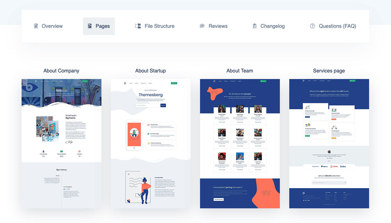
The Pages section is also something that our users appreciate and especially in situations where they browse through multiple products and get used to having a proper overview of all the unique pages the product comes with. Of course all these pages have a screenshot, page title and it links to the correct page from the theme.
The FAQ section is nothing completely new, however this FAQ is unique for every product we create. We think this is mandatory since a UI Kit is quite different from a theme when it comes to implementation and use. Also what happens when we start a new series of themes without Gulp? We want our products to be relevant as time goes by and we want to give the proper care for each new theme that we create.
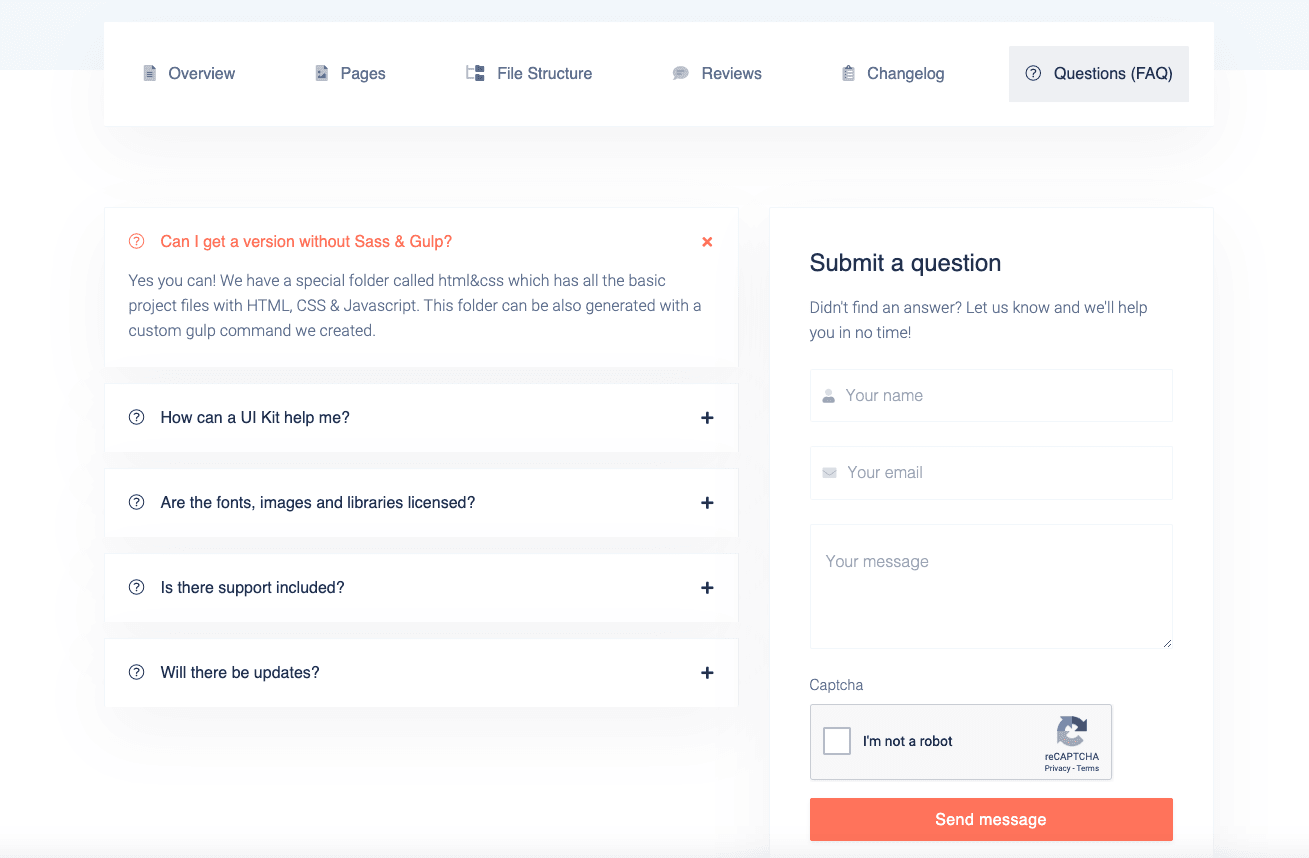
As a last thought for the FAQ section we decided to throw in a contact form so the user doesn't have to navigate all the way to the contact page in case he has a question about the product he couldn't find in the FAQ list.
Results based on Google Analytics (bounce rate, time spent on page)
We uploaded the new product page design on the 31th of October so we will compare the statistics from October when the old design was still in place with November where the new design has already been pushed live.
| Product | Bounce rate | Avg. time on page |
|---|---|---|
| Pixel Lite | 46.62% vs 31.74% (46.90%) | 00:00:56 vs 00:00:48 (18.16%) |
| Pixel Pro | 27.56% vs 20.83% (32.31%) | 00:01:15 vs 00:01:18 (-4.11%) | Spaces | 35.42% vs 53.01% (-33.19%) | 00:01:23 vs 00:01:31 (-8.83%) |
As it can be observed the bounce rate and average time on page has either improved or got worse but the page value on average has increased 16.31% based on the conversion rate. Also if the average time spent on page has decreased it can also mean that the user understands faster the information about the product which increases the likelihood of a conversion.
Please do note that this is only a one month worth of statistics so take it with a grain of salt. Overall I think that the transformation was a success and we got great feedback for the new product page.
Let us know in the comment section if you would have done things differently or if you also plan on increasing the conversion rate on your product page!
Check out some awesome free and premium Bootstrap Themes, Templates and UI Kits from Themesberg.