Bootstrap 5 Alpha 3 is here: new accordion component, floating labels, and a new file input
Just about a day ago, I saw on my Twitter feed that Bootstrap 5 Alpha 3 has officially arrived bringing some new features, such as a brand new accordion component, floating labels for input form elements, improvements for the block button component, and a few more utility classes and icons.
As a refresher, let me remind you that the first version of Bootstrap 5 was launched on the 26th of June, 2020 bringing drastic changes, such as removing jQuery as a dependency and dropping support for Internet Explorer 10 and 11.
Without further ado, let’s see what changes the new Alpha 3 version brings to Bootstrap 5.
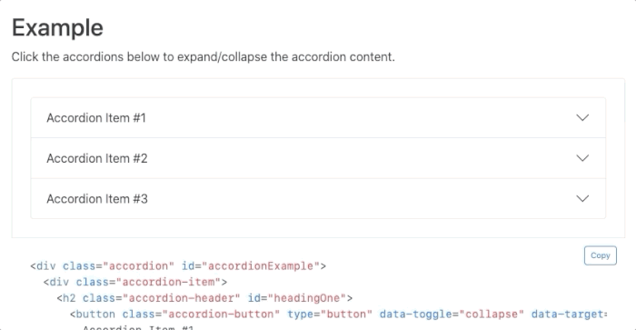
New accordion component
The accordion component has been completely changed as a standalone component as opposed to being a .card based element, which supposedly solves several problems it had in terms of usability.
<div class="accordion" id="accordionExample">
    <div class="accordion-item">
    <h2 class="accordion-header" id="headingOne">
        <button class="accordion-button" type="button" data-toggle="collapse" data-target="#collapseOne" aria-expanded="true" aria-controls="collapseOne">
        Accordion Item #1
        </button>
    </h2>
    <div id="collapseOne" class="accordion-collapse collapse show" aria-labelledby="headingOne" data-parent="#accordionExample">
        <div class="accordion-body">
        <strong>This is the first item's accordion body.</strong> It is hidden by default, until the collapse plugin adds the appropriate classes that we use to style each element. These classes control the overall appearance, as well as the showing and hiding via CSS transitions. You can modify any of this with custom CSS or overriding our default variables. It's also worth noting that just about any HTML can go within the <code>.accordion-body</code>, though the transition does limit overflow.
        </div>
    </div>
    </div>
    <div class="accordion-item">
    <h2 class="accordion-header" id="headingTwo">
        <button class="accordion-button collapsed" type="button" data-toggle="collapse" data-target="#collapseTwo" aria-expanded="false" aria-controls="collapseTwo">
        Accordion Item #2
        </button>
    </h2>
    <div id="collapseTwo" class="accordion-collapse collapse" aria-labelledby="headingTwo" data-parent="#accordionExample">
        <div class="accordion-body">
        <strong>This is the second item's accordion body.</strong> It is hidden by default, until the collapse plugin adds the appropriate classes that we use to style each element. These classes control the overall appearance, as well as the showing and hiding via CSS transitions. You can modify any of this with custom CSS or overriding our default variables. It's also worth noting that just about any HTML can go within the <code>.accordion-body</code>, though the transition does limit overflow.
        </div>
    </div>
    </div>
    <div class="accordion-item">
    <h2 class="accordion-header" id="headingThree">
        <button class="accordion-button collapsed" type="button" data-toggle="collapse" data-target="#collapseThree" aria-expanded="false" aria-controls="collapseThree">
        Accordion Item #3
        </button>
    </h2>
    <div id="collapseThree" class="accordion-collapse collapse" aria-labelledby="headingThree" data-parent="#accordionExample">
        <div class="accordion-body">
        <strong>This is the third item's accordion body.</strong> It is hidden by default, until the collapse plugin adds the appropriate classes that we use to style each element. These classes control the overall appearance, as well as the showing and hiding via CSS transitions. You can modify any of this with custom CSS or overriding our default variables. It's also worth noting that just about any HTML can go within the <code>.accordion-body</code>, though the transition does limit overflow.
        </div>
    </div>
    </div>
</div>
According to the official team, it still uses the Collapse Javascript plugin, however, having custom HTML and CSS it is now much easier to use.
Another feature is that the new accordion component now uses the Chevron icons from the official Bootstrap SVG Icons library. Check out all of the details on the official Bootstrap accordion documentation page.
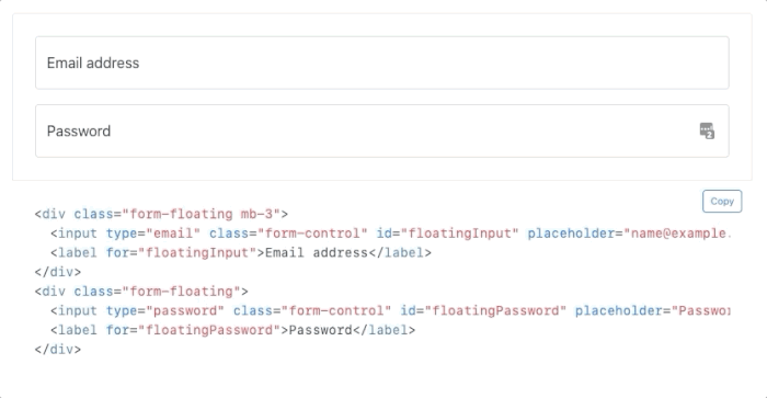
Floating labels (aka. Material UI labels)
If you’re a fan of Material UI or floating labels, then this comes as great news. By adding the .form-floating class to the wrapper div of the form and label elements, the labels will be integrated into the input element, and update its position based on the contents inside the input or whether it is being focused or not.
<div class="form-floating mb-3">
    <input type="email" class="form-control" id="floatingInput" placeholder="[email protected]">
    <label for="floatingInput">Email address</label>
</div>
<div class="form-floating">
    <input type="password" class="form-control" id="floatingPassword" placeholder="Password">
    <label for="floatingPassword">Password</label>
</div>
This has been the main feature of Material UI back in the days and is being used even today because it saves a lot of space for the form elements, effectively merging the label elements with the input component in terms of design.
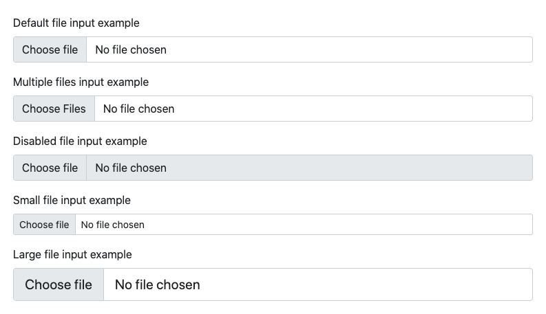
New file input
<div class="mb-3">
    <label for="formFile" class="form-label">Default file input example</label>
    <input class="form-control" type="file" id="formFile">
</div>
<div class="mb-3">
    <label for="formFileMultiple" class="form-label">Multiple files input example</label>
    <input class="form-control" type="file" id="formFileMultiple" multiple>
</div>
<div class="mb-3">
    <label for="formFileDisabled" class="form-label">Disabled file input example</label>
    <input class="form-control" type="file" id="formFileDisabled" disabled>
</div>
<div class="mb-3">
    <label for="formFileSm" class="form-label">Small file input example</label>
    <input class="form-control form-control-sm" id="formFileSm" type="file">
</div>
<div>
    <label for="formFileLg" class="form-label">Large file input example</label>
    <input class="form-control form-control-lg" id="formFileLg" type="file">
</div>
The team behind Bootstrap created a new file input element that no longer requires JavaScript to make it functional because it now only uses CSS. You no longer need to use the custom .form-file class, because styles will be applied only using the .form-control class.
Utility API additions
The Utility API came as a brand new feature for Bootstrap 5 as there is a growing trend in using utility classes when building user interfaces. Here’s the list of some of the new default values of classes:
- Added
.d-gridfordisplay: grid - Added
.fsutilities forfont-size - Renamed
font-weightutilities to.fw - Added
.rounded-1,.rounded-2, and.rounded-3for new small, medium, and largeborder-radiusutilities - Added
.overflow-visibleand.overflow-scrollutilities
Other minor fixes and improvements have been added across the library and you can browse the full changelog here.
What’s coming for Beta 1?
The Bootstrap 5 Beta version is just around the corner, and we already know some of the new features that will be added. We’re expecting an official RTL support, and the PR on GitHub for this feature is already being reviewed.
Other features include updating to Popper.js v2, using namespaces data attributes, and updating the Utility with pseudo-classes support via a state option.
Getting started with Bootstrap 5
A few months ago we wrote an extensive guide on how you can get started with Bootstrap 5 without jQuery. You will learn how to set up Bootstrap 5 using Sass, Gulp, and BrowserSync and build awesome websites with the newest version of Bootstrap.
Bootstrap 5 Templates and Themes
You can also check out some of the Free and Premium Bootstrap 5 Templates that we have built here at Themesberg based on Bootstrap 5.