Glassmorphism tutorial - learn how to implement the new design trend using only HTML and CSS
There’s a new design trend emerging that you may have noticed if you regularly browse design related websites, such as Dribbble. Not only that, but it is also being used by well established brands, such as Apple and Microsoft. So what exactly is it?
Technically, it’s a transparent background with some added blur, shadow, and a light border color used for some card-like elements above a colorful background. This creates a more personalized look for the user interface, based on the background being used.
It’s called glassmorphism.
I don’t want to dwelve into the particularaties in terms of design, an awesome article on UX Collective has already extensively covered this, but I do want to show you how you can achieve this effect using only HTML and CSS.
Here’s a table of contents for this tutorial:
So without further ado, let’s get started!
Choosing a background
The first thing to understand about glassmorphism is that not any type of background image or gradient will match. It is encouraged to use vivid colors, and using shapes and more simple backgrounds will be key to instead of very detailed images.
In this case, we’re going to apply a background gradient effect so that loading time will not be increased by an actual image.
Add the following styles to the <body> tag of the HTML file:
body {
    background: #edc0bf;
    background: linear-gradient(90deg, #edc0bf 0,#c4caef 58%);
    padding: 4.5rem;
    margin: 0;
}
The first background property will be used as a fallback in case the gradient property is not supported by a certain browser, although most modern browsers already support it.
Let’s also use a better font style, such as Inter from Google fonts. Include the font by adding the following code inside the <head> tag:
<link href="https://fonts.googleapis.com/css2?family=Inter:wght@300;400;500;600;700&display=swap" rel="stylesheet">
Then proceed by applying the font family to the body tag in your CSS file:
body {
    /* other styles */
    font-family: 'Inter', sans-serif;
}
Creating a card element
Let’s start by setting up the HTML markup for the card that will actually have the glassmorphic effect. Let’s keep it simple by adding a title, description, and a link:
<div class="card">
    <h3 class="card-title">Glassmorphism is awesome</h3>
    <p>A modern CSS UI library based on the glassmorphism design principles that will help you quickly design and build beautiful websites and applications.</p>
    <a href="https://ui.glass">Read more</a>
</div>
Let’s add some basic styling to the cards and the elements:
.card {
    width: 400px;
    height: auto;
    padding: 2rem;
    border-radius: 1rem;
}

.card-title {
    margin-top: 0;
    margin-bottom: .5rem;
    font-size: 1.2rem;
}

p, a {
    font-size: 1rem;
}

a {
    color: #4d4ae8;
    text-decoration: none;
}
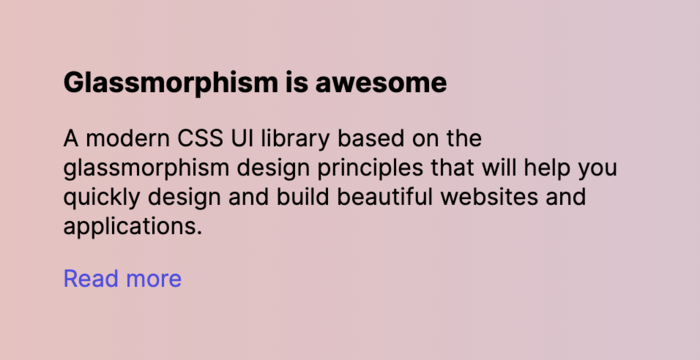
Now it looks a little bit better, but as you can see there’s still no background. The reason for that is because I’m going to show you how to add the effect in the next section.
Adding the glassmorphism effect
Adding the effect is pretty straightforward by setting a semi-transparent background and using the backdrop-filter property to add a blur effect to the background. Add the following properties to the .card element in your CSS file:
.card {
    background: rgba(255, 255, 255, .7);
    -webkit-backdrop-filter: blur(10px);
    backdrop-filter: blur(10px);
}
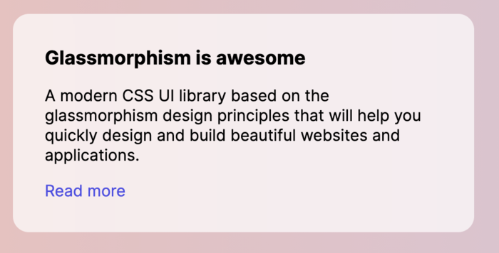
Awesome! You’ll see that the background is now white and semi-transparent, but you may ask, where’s the glassmorphism effect?
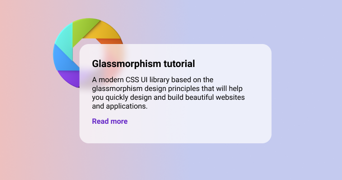
Well, you can’t see it yet, because there’s nothing behind the element distinctive enough to create this. So we’re going to add a shape using a SVG image.
Add the following HTML markup:
<img class="shape" src="https://s3.us-east-2.amazonaws.com/ui.glass/shape.svg" alt="">
Add the following CSS styles:
.shape {
    position: absolute;
    width: 150px;
    top: .5rem;
    left: .5rem;
}
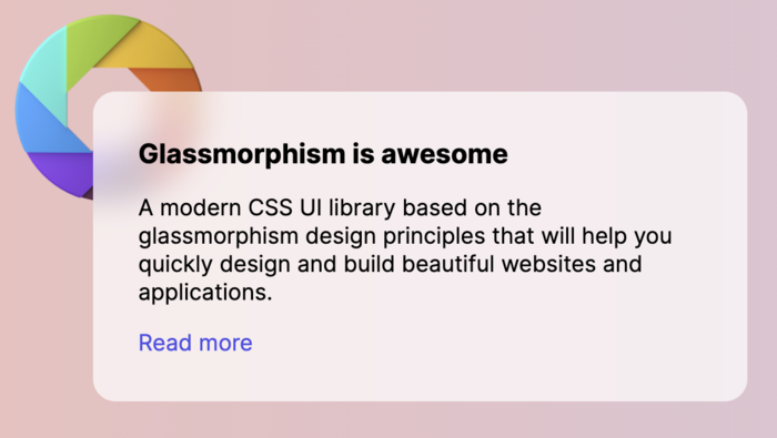
Now you’ll see the full effect of glassmorphism with the more distinctive shape in the behind and the blur effect from the transparent card. Looks awesome!
As you can see, it can take quite a bit of work to properly position the design elements in order to achieve a good glassmorphism effect, but once you have it, it can look really unique.
The shape behind the element could be anything, theoretically at least. But it is preferred that they are shapes, or illustrations, mostly elements that are not too rich in detail.
Here’s a codepen example for the code in this tutorial if you want to play around with it:
See the Pen Glassmorphism effect by Themesberg (@themesberg) on CodePen.
Browser support
As web developers, we have a duty to make sure that the code we write is accessible to most of the browsers on the market. Most of the CSS properties that we have used in this tutorial are supported by all browsers, except for one: the backdrop-filter property.
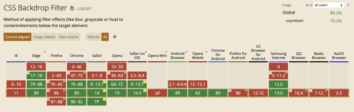
It is not supported at all by IE 11, which to be honest, won’t matter too much in the coming years. With the arrival of Bootstrap 5, they also no longer added support for IE 11>, additionally, Microsoft announced that it will end support for IE 11 in August this year. So that shouldn’t concern us too much.
There is, however, another possible problem here. For some reason, Firefox doesn’t have the backdrop-filter property enabled by default, even though the browser supports this styling. We hope that in the near future this feature will be enabled by default.
You can read more about the browser support for the backdrop-filter property on caniuse.
So based on this, can the glassmorphism effect be used in production mode? Mostly, I’d say yes. The fact that the blur won’t work on a couple of browsers (3.76% for Firefox to be more exact), it doesn’t mean that the interface won’t look good enough for the minority of these browsers.
I wouldn’t necessarily use this for an enterprise level application where accessibility is an important requirement, but I would maybe use it for a personal or business website, even for some application interfaces.
Conclusion
I believe that glassmorphism is an interesting design trend and it can be definitely used in real life applications, however, there are some drawbacks when it comes to implementing it, as you need some designing experience, and there’s also a drawback with the Firefox default support, which may change in the future.
I hope that this tutorial helps you understand more about the new design trend and how to implement it to web interfaces. Before you, let me introduce you to a project that I’ve been working on with my colleague here at Themesberg. It’s called Glassmorphism UI.
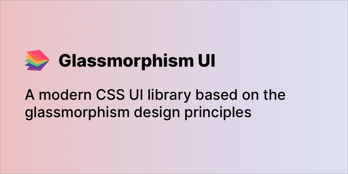
Basically, we’re building a CSS UI library based entirely on the glassmorphism design principles, but in a way that it can be more easily used by developers who are not familiar with designing websites on their own. The project will be open source.
Additionally, you can use CSS generators to avoid some time-consuming, routine tasks. Here is a nice list of CSS generators.
You can sign up for updates and be announced when the project is released at ui.glass.