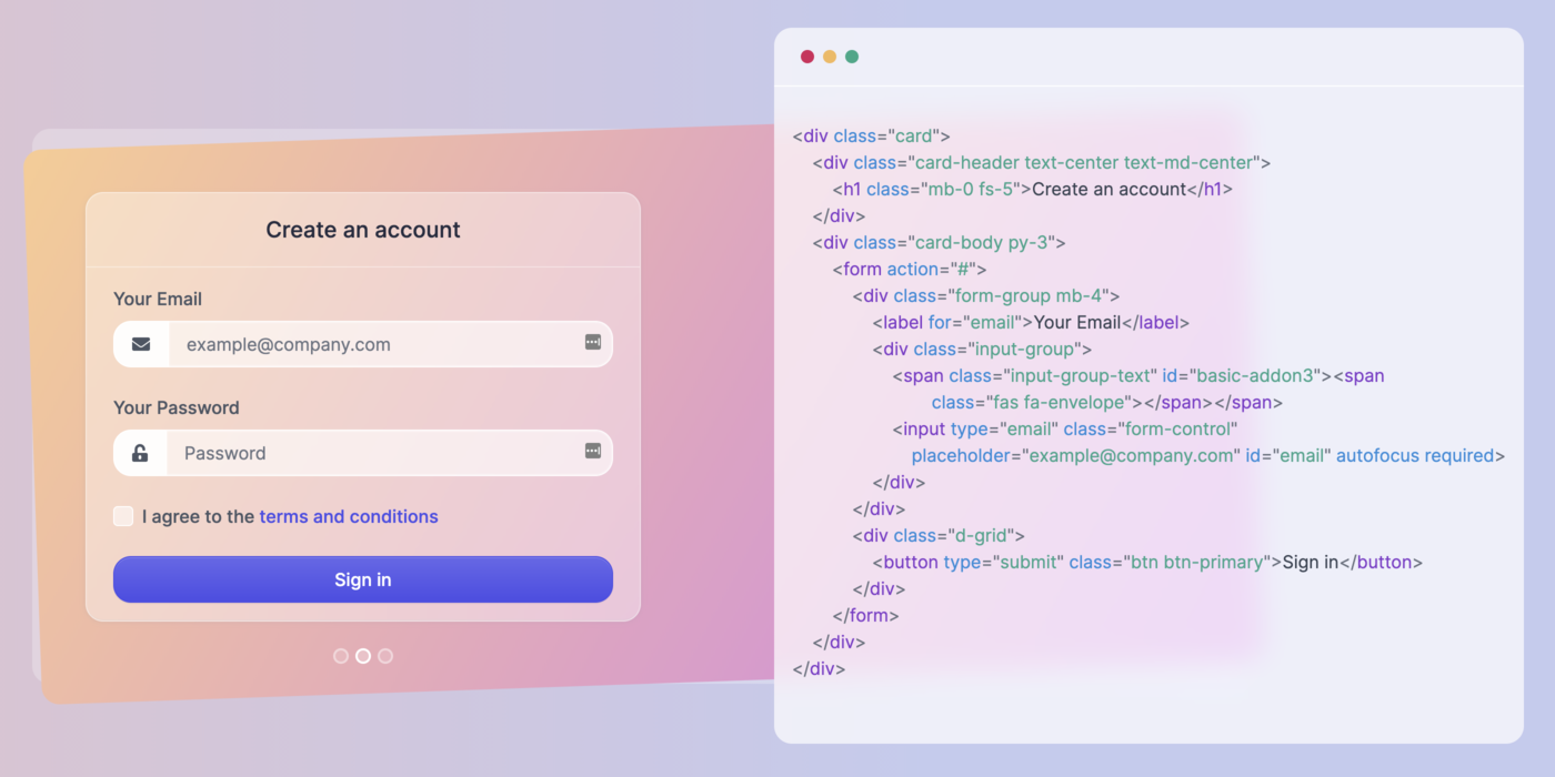
Glassmorphism UI Update #2: tech stack, SVG icons, and a couple of new components
It has been some time since the last update about glassmorphism, but that doesn't mean we haven't been very active working on the project. Progress is good, and we expect to launch the first version sometime in the middle of Q2, around June.
Before I continue, I'm happy to let you know that there are over 850 of us signed up until now for the ui.glass project! That's huge. Thank you. You're awesome.
Tech stack
I sent out a tweet a few hours ago about the tech stack that we're using for the website. We decided to go with HUGO as a static site generator (for the documentation pages), SCSS/CSS for the styles, Webpack, NPM & Yarn for compiling, bundling, dependencies, Javascript, and Post CSS.
Here's the tech stack that we're using for https://t.co/ZwIVyP7RH3:
— Zoltán Szőgyényi (@zoltanszogyenyi) April 5, 2021
- HUGO static site generator
- SCSS/CSS
- Webpack + NPM & Yarn
- Javascript
- PostCSS
The library will be available via NPM and CDN to pull in easily. pic.twitter.com/f1JMkZJaWm
Ultimately, we will open source the code that will be used to build the ui.glass website, and the library itself will be available via NPM and CDN. We didn't decide yet on which service will be used, but we like unpkg.
SVG icons
Initially, we wanted to use FontAwesome for the icon set, but later decided to switch things up and also using exclusively SVG powered icons. The icon set that will be used is also open source under the MIT license. Here's a sneak preview:
![]()
We used one of the icon sets from this list of open source resources. Try guessing which one it is by replying to this email ?
New components
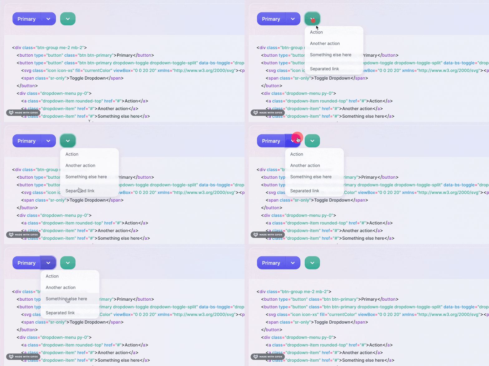
The last couple of weeks we worked on the alert, accordion, dropdown, and button components. I regularly tweet about the new elements that we build, but here's a preview of the dropdown component:

As you can see, there is a slight glassmorphism effect on the dropdown menu. We try not to overuse the effect, because glassmorphism is not just about transparency and blurred background everywhere. Using too much of it can also do a lot of harm UI-wise.
In fact, most of the components will be regular, but good looking, accessible, and easy-to-use elements. Glassmorphism will be applied only where it truly makes sense, and the dropdown elements are great for that.
Glassmorphism on Freecodecamp.org
Last week I wrote an article introducing glassmorphism to the Freecodecamp community. Oh boy, lots of reactions, new sign ups, tweet upon tweets. Glassmorphism has been all around the web for designers, but it is only now being introduced to devs as well.
What next?
We will keep making progress on the components, and I expect finishing the badge, breadcrumb, and a couple of card components next. We also need to work on the documentation layout as well. Another status update will likely come in about one or two weeks. Until then, you can follow my daily tweets.
Want to help?
This is an open-source project, and we expect nothing extra from anyone. But if you do want to help, we could use a bit of "word-of-mouth" recommendation from you guys! If you have a friend, colleague, a blog, share this project with them, because they may also like it. That would be greatly appreciated!
