Tailwind CSS tutorial - Learn how to build websites using a utility-first CSS framework
In this tutorial I would like to introduce you to one of the fastest growing and promising CSS Frameworks at the moment, Tailwind CSS. It is different from other frameworks, such as Bootstrap, because it is built on a new way of building user interfaces using a utility-first CSS classes structure, as opposed to the OOCSS structure from other frameworks.
By the end of this guide you will be able to install, configure and build a responsive hero section (live demo) using the utility-first classes from Tailwind CSS and configure the project using the recommended PostCSS powered Tailwind configuration file for better maintainability and versatility.
Here’s the table of contents for this tutorial for Tailwind CSS:
- Introducing Tailwind CSS
- Adding Tailwind CSS to your project via a package manager
- Creating the configuration file and process your CSS with Tailwind
- Building a responsive hero section using the utility-first classes from Tailwind
- Customize fonts, colors and add extra classes using the configuration file
- Reduce loading time and file size by purging the unused classes from your CSS
- Conclusion and summary
Before getting started, below you will find the final folder structure that you should have by the end of this tutorial.
.
├── index.html
├── main.css
├── output.css
├── package-lock.json
├── package.json
└── tailwind.config.js
I believe that it will be helpful if you get lost along the way. If you want to download the files, you can find them on our public Github repository under the MIT license.
Without further ado, let’s get started!
Introducing Tailwind CSS
Tailwind CSS is the most popular utility-first CSS framework in the world for rapidly building custom user interfaces for the web. It is a highly customizable collection of low-level CSS utility classes written in PostCSS destined to be customized using JavaScript.
The first release of Tailwind CSS happened on the 1st of November, 2017 on GitHub as an open-source project. Initially, it was only a side-project for Adam Wathan that helped him with some of his projects, but in time became a fully-fledged and popular CSS framework with a new utility-first methodology.
By the beginning of August 2020 it is estimated that it was downloaded by over 10 million times, making it one of the most rapidly growing CSS frameworks in the world at the time and by the end of September 2020 it is estimated that the official Tailwind CSS documentation was accessed by over 1 million developers worldwide.
It is different from other CSS Frameworks, such as Bootstrap, because of the new way of building user interfaces using a utility-first approach, rather than an object oriented one. I wrote a pretty extensive article comparing Bootstrap to Tailwind a while ago.
Adding Tailwind CSS to your project via a package manager
There are multiple ways of including Tailwind CSS into your project, and even though you can do it really fast via a CDN, the most recommended method is to use a package manager and then make full use of the configuration possibilities via PostCSS using building tools.
In this tutorial I will show you how to include the latest stable version of Tailwind CSS via NPM and then create a Tailwind configuration file and process the CSS based on that.
First of all, make sure you Node.js and NPM installed on your machine. If you don’t already have a package.json file, then run the following command using the terminal inside the root directory of your project:
npm init
This will create a package.json file that holds information about your project and future library dependencies. After you have done it, run the following command in your terminal to install the latest stable version of Tailwind CSS and save it as a dependency:
npm install tailwindcss --save
What this does is that Tailwind CSS will now be available in your node_modules folder and the next time you will run npm install it will automatically download Tailwind CSS into your project as a dependency. It’s an easy way to manage project dependencies across environments such as your local development files and production code from the server.
Adding Tailwind to your CSS
Now that you have installed Tailwind CSS using NPM, you will need to use the custom @tailwind directive and inject Tailwind’s base, components, and utilities styles into your main CSS file.
To do this, create a new CSS file called main.css (or any other preferred name) and add the following lines of code inside it:
@tailwind base;

@tailwind components;

@tailwind utilities;
What this does is that as soon as this file will be processed using Tailwind it will be swapped with the actual CSS styles from Tailwind. You’ll see soon exactly what will happen.
Creating the configuration file and process your CSS with Tailwind
The recommended way of developing with Tailwind CSS is to have a configuration file that you will edit along the way based on your needs. You will be able to easily add and modify the default utility classes from Tailwind. Practically, it will be very easy to change fonts, colors, sizings, spacings and literally anything.
Using the Tailwind CLI run the following command and generate a boilerplate configuration file:
npx tailwindcss init
This will generate a file called tailwind.config.js having the following content:
// tailwind.config.js
module.exports = {
    future: {},
    purge: [],
    theme: {
    extend: {},
    },
    variants: {},
    plugins: [],
}
Now add the following two plugins:
plugins: [
    // ...
    require('tailwindcss'),
    require('autoprefixer'),
    // ...
]
Processing your CSS with Tailwind
Later in this tutorial I will show you how to automatically watch for changes in your CSS file, but for now you can just run the following command to compile the main.css file and create a new file called output.css, which will be the actual CSS file that will be included in the HTML files:
npx tailwindcss build main.css -o output.css
If you take a look at your folder structure, you will see that a new output.css file was generated which holds all of the default Tailwind CSS utility classes based on the configuration file that we have created.
Including Tailwind CSS into your HTML templates
Create an HTML file called index.html in your root project directory and make sure to include the output.css CSS file inside the head tag of your template:
<!DOCTYPE html>
<html lang="en">
<head>
    <meta charset="UTF-8">
    <meta name="viewport" content="width=device-width, initial-scale=1.0">
    <title>Tailwind CSS Tutorial by Themesberg</title>
    <link rel="stylesheet" href="output.css">
</head>
<body>
    <!-- Build awesome user interfaces using Tailwind CSS starting from here -->
</body>
</html>
Congratulations! You have successfully set up Tailwind CSS using the recommended method by the official documentation. In the next section of this tutorial you will learn how to build a responsive hero section using the utility classes from Tailwind CSS.
Building a responsive hero section using the utility-first classes from Tailwind
Let’s now get started by building a hero section using the utility-first classes from Tailwind CSS. The goal is to create a navigation bar with a logo, menu items and some call to action buttons and then follow up with a hero section.

Within your index.html file, create two new HTML tags that will be the wrapper and navigation element of the page:
<header>
    <nav>
        <!-- Logo will come here -->

        <!-- Menu items in the center here -->

        <!-- CTA buttons will come here -->
    </nav>
</header>
Now that you have created the base section of the navigation bar, you can now start using the utility classes from Tailwind CSS to set up the layout and element. First of all, you need to wrap the navigation bar within a container so that it will be properly aligned with the content below.
Add the following classes to the <nav> element:
<nav class=”flex items-center justify-between p-6 container mx-auto”>
Let’s break down each class and what it means:
- flex - applies the
display: flexproperty to the element - items-center - using flexbox it will vertically align the elements within the nav HTML tag
- p-6 - adds padding to all directions for the
<nav>element - container - sets the
max-widthof an element to match themin-widthof the current breakpoint (by default1280px max-width) - mx-auto - applies an margin:auto, thus centering the nav element horizontally
Let’s continue by adding a logo to the left side of the navigation bar. I prefer adding inline SVG for the logo because of increased loading time and customization possibilities. Here’s the Themesberg logo in SVG format with the original Tailwind CSS colors:
<a href=”#”>
    <svg class="h-10 w-10" xmlns="http://www.w3.org/2000/svg" viewBox="0 0 54 64"><defs><style>.cls-1{fill:#319795;}.cls-2,.cls-4{fill:#2a344f;}.cls-2{opacity:0.32;isolation:isolate;}.cls-3{opacity:0.16;}</style></defs><title>logo</title><g id="Layer_2" data-name="Layer 2"><g id="Layer_1-2" data-name="Layer 1"><g id="Group_16" data-name="Group 16"><g id="Group_15" data-name="Group 15"><g id="Group_12" data-name="Group 12"><path id="Path_35" data-name="Path 35" class="cls-1" d="M53.52,1.87l-22,5.39a1.61,1.61,0,0,1-1.23-.21L19.89.25a1.57,1.57,0,0,0-1.3-.19l-18,5.3A.77.77,0,0,0,0,6.09V16.87L18.59,11.4a1.57,1.57,0,0,1,1.3.19l10.4,6.79a1.53,1.53,0,0,0,1.23.21L54,13.09V2.23a.39.39,0,0,0-.39-.38Z"></path><path id="Path_36" data-name="Path 36" class="cls-1" d="M40.25,27.84l-8.73,2.1a1.57,1.57,0,0,1-1.23-.21l-10.4-6.8a.37.37,0,0,0-.53.11.31.31,0,0,0-.07.2V33.47a.75.75,0,0,0,.34.63l10.66,7a1.57,1.57,0,0,0,1.23.2l9.23-2.21A6.86,6.86,0,0,0,46,32.45v-.21a4.62,4.62,0,0,0-4.68-4.55A4.93,4.93,0,0,0,40.25,27.84Z"></path><path id="Path_37" data-name="Path 37" class="cls-1" d="M40.25,50.52l-8.73,2.1a1.61,1.61,0,0,1-1.23-.21l-10.4-6.8a.38.38,0,0,0-.53.1.35.35,0,0,0-.07.21V56.15a.75.75,0,0,0,.34.63l10.66,7a1.53,1.53,0,0,0,1.23.21l9.23-2.22A6.84,6.84,0,0,0,46,55.13v-.21a4.62,4.62,0,0,0-4.68-4.55A4.39,4.39,0,0,0,40.25,50.52Z"></path></g><path id="Path_38" data-name="Path 38" class="cls-2" d="M30.86,41.29V30a1.63,1.63,0,0,0,.66,0L35.28,29l2.2,10.8-6,1.46A1.47,1.47,0,0,1,30.86,41.29Zm8.82,9.33-8.16,2a1.63,1.63,0,0,1-.66,0V64a1.63,1.63,0,0,0,.66,0l10.36-2.54Zm-8.82-32a1.63,1.63,0,0,0,.66,0l1.57-.38L30.86,7.28Z"></path><g id="Group_13" data-name="Group 13" class="cls-3"><path id="Path_39" data-name="Path 39" class="cls-4" d="M19.29,11.36a1.82,1.82,0,0,1,.6.23l10.4,6.8a1.41,1.41,0,0,0,.57.22V7.27a1.41,1.41,0,0,1-.57-.22L19.89.25a1.82,1.82,0,0,0-.6-.23Z"></path><path id="Path_40" data-name="Path 40" class="cls-4" d="M30.86,52.64a1.67,1.67,0,0,1-.57-.23l-10.4-6.8a.39.39,0,0,0-.54.11.36.36,0,0,0-.06.2V56.15a.75.75,0,0,0,.34.63l10.66,7a1.73,1.73,0,0,0,.57.22Z"></path><path id="Path_41" data-name="Path 41" class="cls-4" d="M19.89,22.93a.39.39,0,0,0-.54.11.36.36,0,0,0-.06.2V33.47a.75.75,0,0,0,.34.63l10.66,7a1.58,1.58,0,0,0,.57.22V30a1.43,1.43,0,0,1-.57-.23Z"></path></g></g></g></g></g></svg>
</a>
Now that we have a logo, we need to create the menu items as well. Right after the logo, add the following HTML markup:
<div class="text-lg text-gray-600 hidden lg:flex">
    <a href="#" class="block mt-4 lg:inline-block text-teal-600 lg:mt-0 mr-10">
        Home
    </a>
    <a href="#" class="block mt-4 lg:inline-block hover:text-gray-700 lg:mt-0 mr-10">
        Services
    </a>
    <a href="#" class="block mt-4 lg:inline-block hover:text-gray-700 lg:mt-0 mr-10">
        Portfolio
    </a>
    <a href="#" class="block hover:text-gray-700 mt-4 lg:inline-block lg:mt-0 mr-10">
        Company
    </a>
    <a href="#" class="block hover:text-gray-700 mt-4 lg:inline-block lg:mt-0">
        Contact
    </a>
</div>

Let’s first break down the meaning of the first div element and the classes used:
- text-lg - applies a slightly larger font size for the text inside the element (by default it applies
font-size: 1.125rem;) - text-gray-600 - applies a gray color to the text within the element (starts from
text-gray-100totext-gray-900, 100 being the lightest color and 900 being the darkest) - hidden - applies
display: none;to the element hiding it - lg:flex - this is the first responsive class in this tutorial, we will cover it later, but for now all you need to know is that it applies display:flex for larger screens
Let’s now see what each class means for the actual menu items:
- block - applies
display:block;to the HTML tag - mt-4 - applies margin to the top part of the element
- lg:inline-block - for larger devices the element will become an inline element, making the menu items stay on one row
- hover:text-gray-700 - when hovering over the element, it will make the color of the menu item slightly darker
- lg:mt-0 - for larger devices don’t apply the top margin (makes sense, because on mobile the menu items will be shown one under each other, whereas on larger devices they’re all on one row)
- mr-10 - applies a margin to the right side of the element to properly space the menu items between each other
Ultimately let’s add two CTA buttons and show a hamburger menu icon for mobile devices to the right side of the navigation bar:
<div class="flex items-center">
    <div class="mr-5 lg:mr-0">
        <button class="py-2 px-6 rounded-md text-gray-600 hover:text-gray-700 text-lg">Sign in</button>
        <button class="py-2 px-6 bg-teal-500 hover:bg-teal-600 rounded-md text-white text-lg">Sign up</button>
    </div>
    <div class="block lg:hidden">
        <button class="flex items-center px-4 py-3 border rounded text-teal-500 border-teal-500 focus:outline-none">
            <svg class="fill-current h-3 w-3" viewBox="0 0 20 20" xmlns="http://www.w3.org/2000/svg">
                <title>Menu</title>
                <path d="M0 3h20v2H0V3zm0 6h20v2H0V9zm0 6h20v2H0v-2z" />
            </svg>
        </button>
    </div>
</div>

The rounded-md class adds a small border radius for the buttons and the other utility classes are similar to the ones used for the previous elements in this tutorial, but with different values and properties.
Here’s the full HTML markup for the navigation bar in case you’re not sure if you got the order right:
<header>
    <nav class="flex items-center justify-between p-6 container mx-auto">
        <!-- Logo -->
        <svg class="h-10 w-10" xmlns="http://www.w3.org/2000/svg" viewBox="0 0 54 64">
            <defs>
                <style>
                    .cls-1 {
                        fill: #319795;
                    }

                    .cls-2,
                    .cls-4 {
                        fill: #2a344f;
                    }

                    .cls-2 {
                        opacity: 0.32;
                        isolation: isolate;
                    }

                    .cls-3 {
                        opacity: 0.16;
                    }
                </style>
            </defs>
            <title>logo</title>
            <g id="Layer_2" data-name="Layer 2">
                <g id="Layer_1-2" data-name="Layer 1">
                    <g id="Group_16" data-name="Group 16">
                        <g id="Group_15" data-name="Group 15">
                            <g id="Group_12" data-name="Group 12">
                                <path id="Path_35" data-name="Path 35" class="cls-1"
                                    d="M53.52,1.87l-22,5.39a1.61,1.61,0,0,1-1.23-.21L19.89.25a1.57,1.57,0,0,0-1.3-.19l-18,5.3A.77.77,0,0,0,0,6.09V16.87L18.59,11.4a1.57,1.57,0,0,1,1.3.19l10.4,6.79a1.53,1.53,0,0,0,1.23.21L54,13.09V2.23a.39.39,0,0,0-.39-.38Z">
                                </path>
                                <path id="Path_36" data-name="Path 36" class="cls-1"
                                    d="M40.25,27.84l-8.73,2.1a1.57,1.57,0,0,1-1.23-.21l-10.4-6.8a.37.37,0,0,0-.53.11.31.31,0,0,0-.07.2V33.47a.75.75,0,0,0,.34.63l10.66,7a1.57,1.57,0,0,0,1.23.2l9.23-2.21A6.86,6.86,0,0,0,46,32.45v-.21a4.62,4.62,0,0,0-4.68-4.55A4.93,4.93,0,0,0,40.25,27.84Z">
                                </path>
                                <path id="Path_37" data-name="Path 37" class="cls-1"
                                    d="M40.25,50.52l-8.73,2.1a1.61,1.61,0,0,1-1.23-.21l-10.4-6.8a.38.38,0,0,0-.53.1.35.35,0,0,0-.07.21V56.15a.75.75,0,0,0,.34.63l10.66,7a1.53,1.53,0,0,0,1.23.21l9.23-2.22A6.84,6.84,0,0,0,46,55.13v-.21a4.62,4.62,0,0,0-4.68-4.55A4.39,4.39,0,0,0,40.25,50.52Z">
                                </path>
                            </g>
                            <path id="Path_38" data-name="Path 38" class="cls-2"
                                d="M30.86,41.29V30a1.63,1.63,0,0,0,.66,0L35.28,29l2.2,10.8-6,1.46A1.47,1.47,0,0,1,30.86,41.29Zm8.82,9.33-8.16,2a1.63,1.63,0,0,1-.66,0V64a1.63,1.63,0,0,0,.66,0l10.36-2.54Zm-8.82-32a1.63,1.63,0,0,0,.66,0l1.57-.38L30.86,7.28Z">
                            </path>
                            <g id="Group_13" data-name="Group 13" class="cls-3">
                                <path id="Path_39" data-name="Path 39" class="cls-4"
                                    d="M19.29,11.36a1.82,1.82,0,0,1,.6.23l10.4,6.8a1.41,1.41,0,0,0,.57.22V7.27a1.41,1.41,0,0,1-.57-.22L19.89.25a1.82,1.82,0,0,0-.6-.23Z">
                                </path>
                                <path id="Path_40" data-name="Path 40" class="cls-4"
                                    d="M30.86,52.64a1.67,1.67,0,0,1-.57-.23l-10.4-6.8a.39.39,0,0,0-.54.11.36.36,0,0,0-.06.2V56.15a.75.75,0,0,0,.34.63l10.66,7a1.73,1.73,0,0,0,.57.22Z">
                                </path>
                                <path id="Path_41" data-name="Path 41" class="cls-4"
                                    d="M19.89,22.93a.39.39,0,0,0-.54.11.36.36,0,0,0-.06.2V33.47a.75.75,0,0,0,.34.63l10.66,7a1.58,1.58,0,0,0,.57.22V30a1.43,1.43,0,0,1-.57-.23Z">
                                </path>
                            </g>
                        </g>
                    </g>
                </g>
            </g>
        </svg>

        <!-- Menu items -->
        <div class="text-lg text-gray-600 hidden lg:flex">
            <a href="#" class="block mt-4 lg:inline-block text-teal-600 lg:mt-0 mr-10">
                Home
            </a>
            <a href="#" class="block mt-4 lg:inline-block hover:text-gray-700 lg:mt-0 mr-10">
                Services
            </a>
            <a href="#" class="block mt-4 lg:inline-block hover:text-gray-700 lg:mt-0 mr-10">
                Portfolio
            </a>
            <a href="#" class="block hover:text-gray-700 mt-4 lg:inline-block lg:mt-0 mr-10">
                Company
            </a>
            <a href="#" class="block hover:text-gray-700 mt-4 lg:inline-block lg:mt-0">
                Contact
            </a>
        </div>

        <!-- CTA and Hamburger icon -->
        <div class="flex items-center">
            <div class="mr-5 lg:mr-0">
                <button class="py-2 px-6 rounded-md text-gray-600 hover:text-gray-700 text-lg">Sign in</button>
                <button class="py-2 px-6 bg-teal-500 hover:bg-teal-600 rounded-md text-white text-lg">Sign up</button>
            </div>
            <div class="block lg:hidden">
                <button
                    class="flex items-center px-4 py-3 border rounded text-teal-500 border-teal-500 focus:outline-none">
                    <svg class="fill-current h-3 w-3" viewBox="0 0 20 20" xmlns="http://www.w3.org/2000/svg">
                        <title>Menu</title>
                        <path d="M0 3h20v2H0V3zm0 6h20v2H0V9zm0 6h20v2H0v-2z" />
                    </svg>
                </button>
            </div>
        </div>
    </nav>
</header>
Building the hero section
Now that we’re done with the navigation bar, let’s start building the hero section. It will have two parts: the description part on the left and the sign up form on the right. Let’s start with the wrapper elements, as always:

<main class="mt-12 lg:mt-32">
    <section class="container mx-auto px-6">
        <!-- hero section content goes here -->
    </section>
</main>
The first two utility margin classes from Tailwind CSS for the <main> tag are used to create a proper spacing between the main content and the navigation bar. After that, the classic container classes are being used to center the content horizontally and an extra px-6 is used to apply a padding to match with the spacing of the navigation bar.
Within the <section> tag add the following <div> wrapper elements to create a two column layout for the hero section:
<div class="w-full lg:flex items-center">
    <div class="w-full lg:w-1/2">
        <!-- hero section description goes here -->
    </div>
    <div class="w-full lg:w-1/2 lg:pl-24">
        <!-- sign-up form goes here -->
    </div>
</div>
Here’s a situation where the power of Tailwind CSS unfolds. As we have a two column layout that has to become a column layout on mobile, it is very easy to set these responsive styles using the classes from Tailwind.
The lg:w-1/2 class effectively sets a 50% width for the element, but only for larger devices. By default, it will take the properties from the w-full class which adds a width:100% style to the element. There is an extra lg:pl-24 class added to the second wrapper element to set a spacing between the description and sign-up form on larger devices.
Add the following markup to inside the first <div> wrapper element to add the description text of the hero section:
<h2 class="text-md lg:text-2xl text-gray-600">Market Intelligence Solutions to</h2>
<h1 class="text-5xl lg:text-6xl font-bold text-teal-600 mb-2 lg:mb-6">Win your market</h1>
<p class="text-md lg:text-xl font-light text-gray-800 mb-8">Powerful analytics tools for your business. See the exact keywords for which your competitors rank in organic search and the amount of traffic driven by each of them.</p>

As you can see, we made good use of the text size, color, font weight and spacing classes to quickly set up a nice looking hero section description.
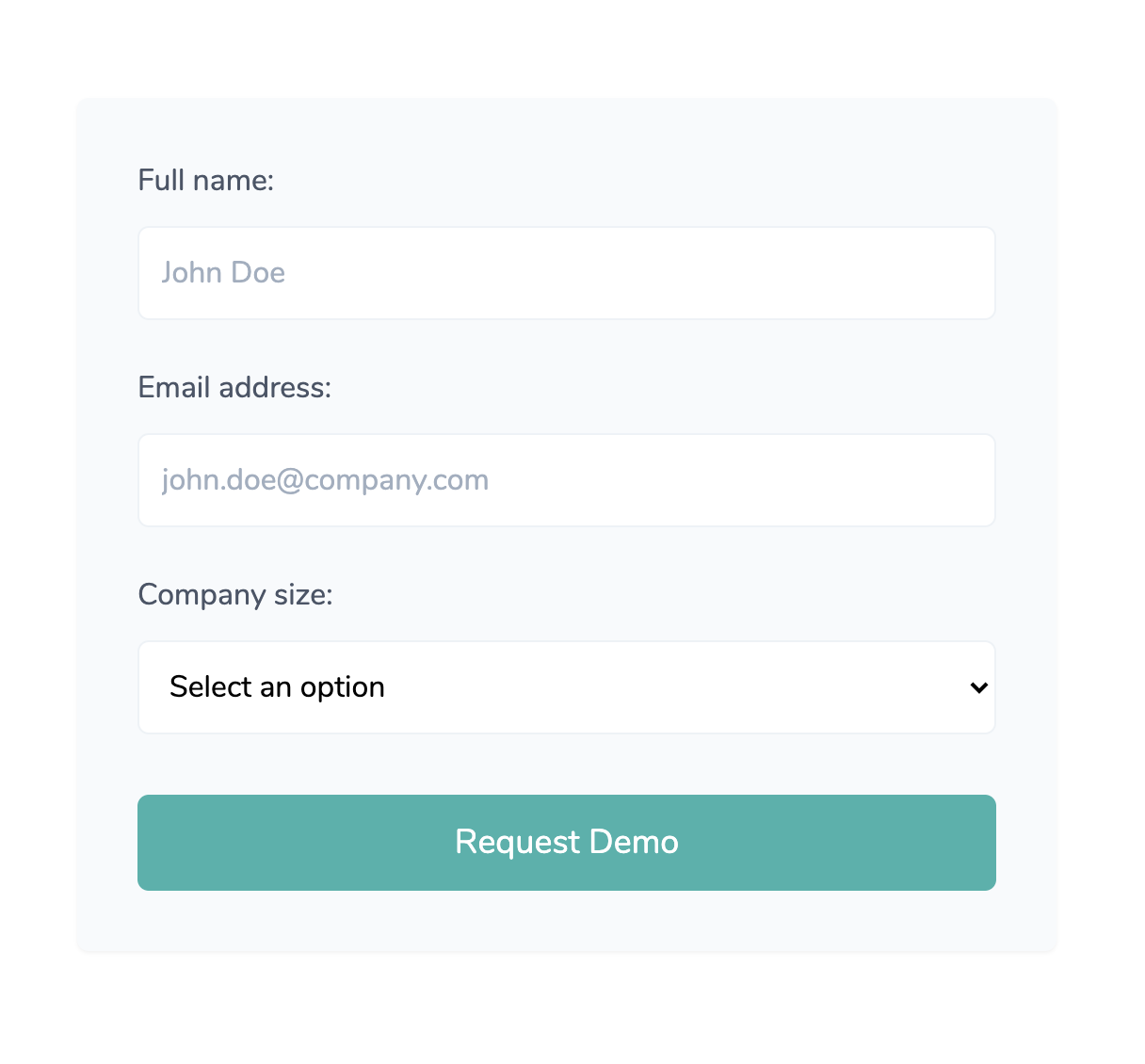
Adding a sign-up form
All we have left to do now to finish the hero section is to create a sign-up form. We will require the user to add her/his full name, email address and the size of her/his company in terms of employees.
Add the following HTML markup inside the second <div> wrapper element of the section:
<form action="#" class="bg-gray-100 shadow-sm rounded-md p-8">
    <div class="mb-6">
        <label for="name" class="mb-3 block text-gray-700">Full name:</label>
        <input type="text" id="name" class="bg-white rounded-md border border-gray-200 p-3 focus:outline-none w-full" placeholder="John Doe" required>
    </div>
    <div class="mb-6">
        <label for="email" class="mb-3 block text-gray-700">Email address:</label>
        <input type="email" id="email" class="bg-white rounded-md border border-gray-200 p-3 focus:outline-none w-full" placeholder="[email protected]" required>
    </div>
    <div class="mb-8">
        <label for="company_size" class="mb-3 block text-gray-700">Company size:</label>
        <select id="company_size" class="bg-white rounded-md border border-gray-200 p-3 focus:outline-none w-full" required>
            <option value="">Select an option</option>
            <option value="1">1-10</option>
            <option value="2">10-50</option>
            <option value="3">50-100</option>
            <option value="4">100+</option>
        </select>
    </div>
    <button type="submit" class="py-3 px-12 bg-teal-500 hover:bg-teal-600 mr-5 rounded-md text-white text-lg focus:outline-none w-full">Request Demo</button>
</form>
As you can see, yet again, we have conveniently used the utility classes to set the styling properties for each element. Here’s a breakdown of the new classes in this example:
- focus:outline-none - removes the default focus outline styling of browsers when focusing on the element
- border - adds a 1px border width to the element
- border-gray-200 - makes the border color a lighter shade of gray
- bg-white - adds a white background to the element
Congratulations! Now you finished a page with a responsive navigation bar and a hero section with a sign-up form using Tailwind CSS. The next few sections of this tutorial will cover customizing the project using the configuration file and reducing the final CSS file size by purging it based on the classes used within your HTML templates.
Customize fonts, colors and add extra classes using the configuration file
Although the default set of classes from Tailwind CSS offer a great variety of styling options, most likely you will need to customize project design properties, such as the font, colors, sizings, spacing, container width and many more.
To change the base font of your project, first you need to make the font available in your project. We love the Nunito font from Google Fonts, but you can choose another one based on your preferences or project requirements. Include the font within your <head> tag in your index.html file:
<link href="https://fonts.googleapis.com/css2?family=Nunito&display=swap" rel="stylesheet">
Afterwards, make sure to swap the default values for the font family used by Tailwind CSS in the tailwinding.config.js file:
module.exports = {
    purge: [],
    theme: {
        fontFamily: {
        sans: ['Nunito', 'sans-serif'],
        display: ['Nunito', 'sans-serif'],
        body: ['Nunito', 'sans-serif']
        },
        extend: {}
    },
    variants: {},
    plugins: [
        require('tailwindcss'),
        require('autoprefixer')
    ]
}
If you run the following command in your terminal, it will process your configuration and main.css file and update the font family that you specified:
npx tailwindcss build main.css -o output.css
If you refresh the main page, you will see that the font has been changed to Nunito from Google Fonts.
Extending Tailwind CSS with custom colors
Most projects come with certain requirements in terms of branding colors, meaning that the default colors provided by Tailwind CSS may not be enough for your needs. In this case, it is best to use the extend method provided by the Tailwind configuration file.
Let’s say you have two colors based on your brand and you need to be able to use them using the Tailwind classes. All you need to do is go to the tailwind.config.js file once again, and add the following two lines to the extend key of the main object:
extend: {
    colors: {
        primary: '#EA755E',
        secondary: '#BD675F'
    }
}
If you use the building command once again in the terminal, the colors you have added are now available with the Tailwind CSS classes and you can apply these colors to text, backgrounds, borders and many more. An example of a usage would be text-primary, border-primary or bg-primary.
Adding properties within the extend key of the main object will not override the current set of classes, but extend them. The previous example of changing the font actually changes the properties of the default classes used by Tailwind.
Reduce loading time and file size by purging the unused classes from your CSS
One of the disadvantages that you may initially encounter using Tailwind CSS is the huge size of the final CSS file. The reason for that is because it includes a wide range of utility classes that may not be ever used within your project.
The good news is that you can easily reduce the file size by removing the unused CSS classes using the purge feature within your tailwind.config.js file.
Add the following line of code to your configuration file:
purge: {
    enabled: true,
    content: [
        './**/*.html'
    ]
}
If you run the building command, you will see that the output.css file is a lot smaller than before and uses only the classes that it has found within your HTML templates specified in the configuration file.
You can read a lot more about the Purge CSS feature at the official documentation.
Tailwind CSS components library - Flowbite
One of the disadvantages that Tailwind has compared to other CSS frameworks is that it doesn't have a base set of web components such as buttons, alerts, navbars that you can use to build interfaces even faster.

A solution to this problem can be an open source library of Tailwind components called Flowbite which includes components and interactive elements such as dropdowns, buttons, navigation bars, modals, datepickers, and more.
Conclusion and summary
I hope this tutorial helped you get a good understanding of what Tailwind CSS is, how it works and the advantages it can have over other CSS Frameworks when it comes to building user interfaces fast and efficiently.
You learned how to install Tailwind CSS using a package manager, learn the base Tailwind CSS utility classes to build a navigation bar and a hero section, use the configuration file to your advantage and reduce the final file size of your CSS. Congratulations!