10 Best Practices for your SaaS Landing Page
SaaS has been a flourishing trend of online businesses in the past couple of years and it shows no signs of slowing down. Seeing services such as Mailchimp, Dropbox, Evernote and others become so successful many other entrepreneurs attempt building a successful SaaS business.
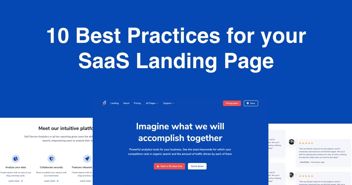
The most important part of your service is to bring value to your potential clients, but if you already have this checked out you also have to get through to them and what better way of doing that than having a great landing page presenting your product and enrolling your future clients into your platform?
Today I want to share with you the 10 best practices for building your SaaS landing page that I believe will significantly increase your chances to get more paying customers.
10. Call to action for a free trial/demo
Nowadays most SaaS websites have an option of trying their service out for free before having to pay. This hugely increases engagement with potential customers and lets them try your service out before deciding to pay for extra options.
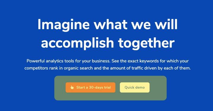
You can either offer a full option free trial but with limited time or continuously offer a free subscription but with limited options.
This call to action element must be clearly visible both in the first section of your landing pages and in the last one. I also recommend having a repeating section at the end of every page and also have an element reminding the users of the trial in the navigation menu.
9. SEO optimization
Search engine optimization is a game changer for your SaaS business in the long term. The sooner you implement SEO best practices, the better. Do your research on keywords and based on them write comprehensive and high quality sentences. Make proper use of heading tags across the sections.
As a bonus I also recommend implementing structured data for better search engine visibility. For a landing page you can use the the Organization schema.
8. Preview of the control panel
Throughout most sections of your landing page it is crucial to present as many previews of the control panel of your service as possible to make visitors understand better what they are signing up for. This can also be done by creating a nice presentational video of your product.
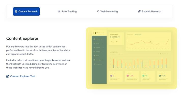
In the image above you can clearly see how the dashboard will look and what features the service offers. I believe this is an ever better way of informing customers with the benefits of your service rather than just describing them.
7. Sections describing your product
It is important to have a few sections with larger amounts of text describing your product in more depth. This is also a good way of optimizing your landing page for SEO purposes by providing more high quality content not only images and CTA’s.
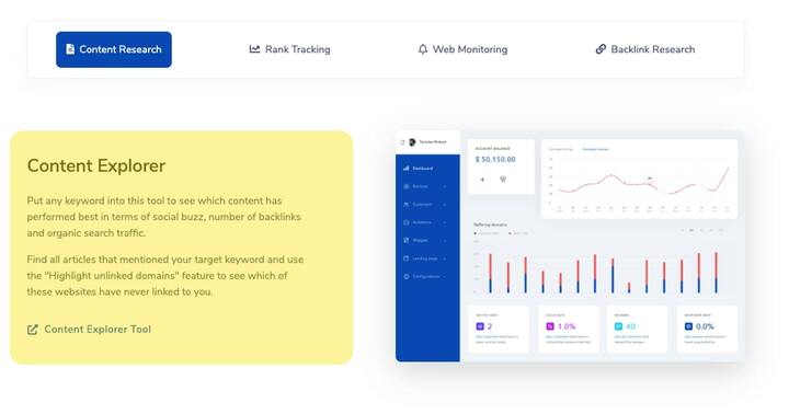
You can go for the classical image and heading + text combination and possibly add a button after the text leading to the main “about page” with more extended information.
6. Responsive design ?
I can’t emphasize enough how important it is to have a fully responsive website. In 2018 worldwide mobile usage was 58% compared to just 42% desktop. While it is true that most conversions happen from desktop visits, there’s no excuse not having a proper mobile version of your website.
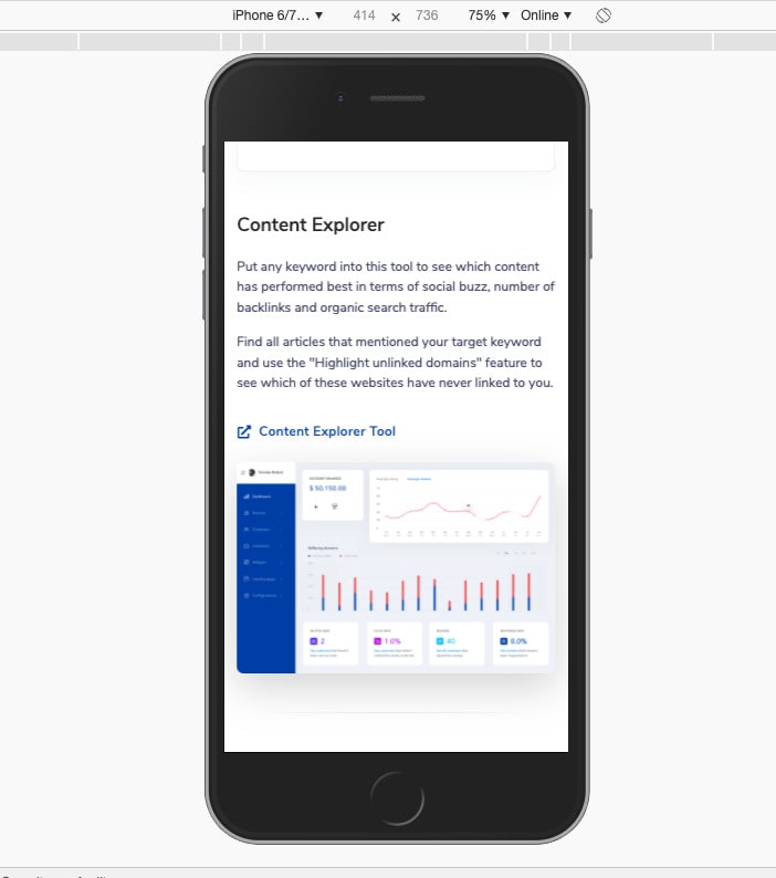
Another reason you should make sure your website is responsive is because in recent years Google has been advocating for mobile-first websites and it is already a ranking factor for search results.
5. List of features that stand out
It is a good idea to have a list of the most notable features and advantages somewhere on the landing page. The list can also be in the form of a few cards with descriptive icons. The idea here is to effectively let your potential customer know in a short amount of time multiple reasons why they should use your platform.
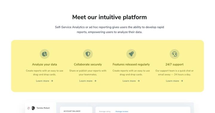
What’s even better is that for each of these list items you can include a link to a page that describes that one feature in depth, which also leads to better SEO and website ranking overall.
4. Testimonials and reviews ⭐️
Of course towards the end of the page it is important to include testimonials and reviews from your customers describing how your service improved their business or work. It is important to include the message, what the name of the individual is, where he works at and what position he holds in that company.
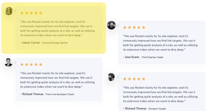
It is a good idea to include a wider variety of job positions so that you can increase the chances of your potential customers identifying themselves faster with the person who wrote the testimonial.
3. Improving speed ⚡️
The ideal load time for a website is between 2-5 seconds. However, because this is a landing page and it does not require a lot of data to be loaded you should keep load time well below 2 seconds. Here’s a couple of things you can do to instantly improve load time:
- Minify HTML, Javascript and CSS files
- Use as few plugins as possible
- Resize and optimize images with lossless compression
- Wherever possible use SVG instead of images (ie. logo, illustrations)
- Mobile-first CSS
- Enable gzip compression for static assets
2. Pricing plan ?
Before the end of the homepage you should have a section that either leads to the main pricing plan page or directly having the pricing plan cards right before the footer. In this section you should clearly let your users know the price and differences between each plan.
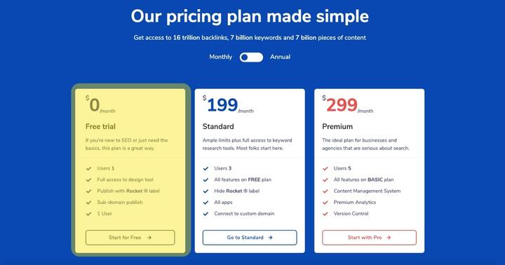
I strongly recommend including a free trial plan for the first card to increase the number of registered users and improve conversion rates.
1. Newsletter subscription & offers ?
Of course it’s a good idea to give the option to your visitors to sign up for a newsletter where you send them emails about your blog posts, offers and new features. It’s a great way to engage with your most loyal customers.
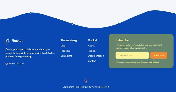
For a SaaS landing page I am a strong advocate not to show pop-ups regarding newsletters. I believe them to be very intrusive and might even scare your customers away. The most elegant way to let visitors know that they can subscribe to your newsletter is having the elements put in your footer or a CTA section right before the footer. It’s ok to have it repeated in every page of your website.
Rocket ? - SaaS Bootstrap Template
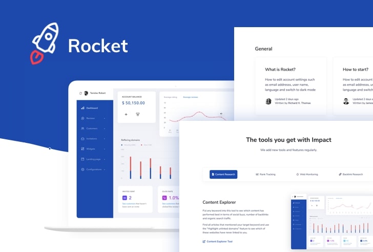
If you would like to save time and money we already created a SaaS Bootstrap template called Rocket featuring all of the points we’ve made in this article. Additionally you also get 23 hands-crafted pages and a complete design system that you can use to develop more pages.
In conclusion, your landing page should be clean, simple and concise but full of relevant information about your service. Call to action elements leading to the product should be accessible from multiple parts of the page and make sure your website looks good on mobile, has a fast loading time and has high quality content for long term SEO advantages.
