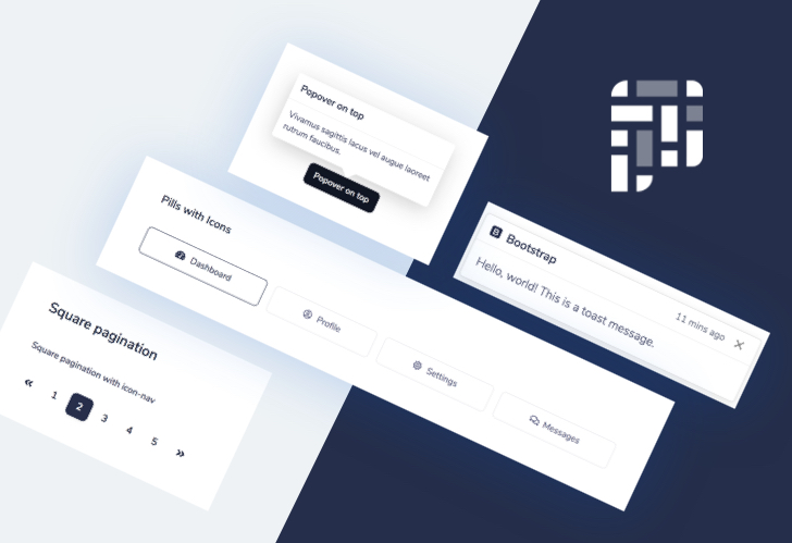
Pixel is a free and open-source Bootstrap 5 based user interface kit featuring over 80 fully coded UI elements and example pages that will help you prototype and build a website for your next project.
Bootstrap 5 no longer requires jQuery as a dependency, meaning that Pixel is a much more lightweight UI Kit compared to other Bootstrap 4 based projects.
This project also comes with Sass source files, making it easy to customize the colors, fonts, and other styling properties. Using the gulp commands you can also easily work with the project and generate minified production code.
Built for developers
Pixel was built by experienced web developers with a focus on good and high-quality code. We know how much time and effort it takes to translate design files into working web components, but we already did that for you so that you can focus on building awesome features rather than writing boilerplate code.
Designed by professionals
Pixel was designed by professional designers to bring you the best of two worlds: appearance and experience. We are true believers in the experience of the user, that’s why you will find that the design is mostly simple and clean, without too many distractions.
80+ Bootstrap 5 components
Pixel is an extension of the Bootstrap 5 CSS framework with a focus on heavy styling customization but also with components that are not found by default in the framework, such as new cards, date pickers, timeline items, and the example pages that we’ve crafted. We invite you to check out the components here.
5 Example pages
We also built a couple of example pages to get you started with a simple website and show you what can be done using the components in this UI Kit. You’ll get a landing page, about page, contact page, and the sign in and sign up pages.
Well documented
We know how important it is to properly document a project, that’s why we took extra time to provide thorough documentation for the Pixel UI library. You can learn more about how to get started with the project and how to use each component and how to customize the Sass.
Customize with Sass
Pixel is built using the Sass variables and mixins, but we also made sure that you have a custom variables file where you can override the default properties that Bootstrap and Themesberg has provided.
Gulp, BrowserSync, and Sass workflow
Pixel is based on a Gulp and BrowserSync workflow which helps to compile and reflect the changes made to the Sass source files, where you can work with variables and mixins to easily change the properties of the elements, such as the colors, fonts, spacings, and many others.
Accessibility
Pixel is built with a focus on accessibility, that’s why we’ve carefully selected the best color scheme for a good contrast for the elements.
Upgrade to Pro
If you want to help the open-source community and if you appreciate Pixel, we invite you to check out the premium version called Pixel Pro which brings a lot more components, plugins, and pages with the same quality and attention to detail as with this project.
